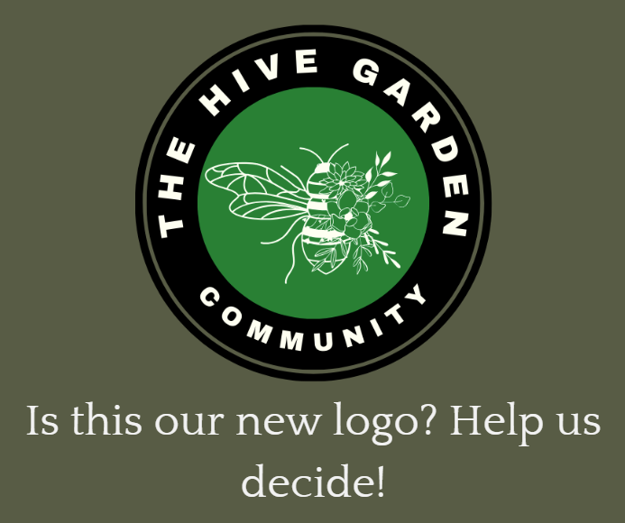
Thanks to everyone who responded with feedback to the logo suggestions yesterday. I think we have more than enough responses to make a decision - at least almost make a decision!
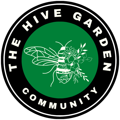
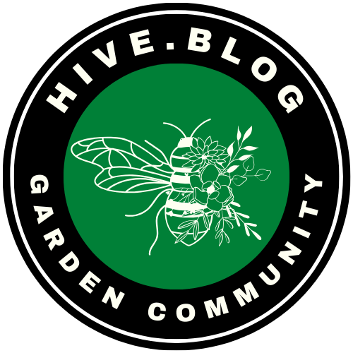
From the comments, a couple of things were clear. The most popular choice was Option B - it was pretty unanimous. People liked it's high contrast, the white enabling the bee to stand out against the dark background.
Option E had some support, mainly for the honeycomb design which represented community, but it didn't stand out against the background so well, so the design needed to be adjusted for better visiblity. Some colours were obviously hard to see in dark mode.
Some suggested changing the images, but as they're from Canva, it's not something I can easily do. I want to keep it simple.
So, keeping it mind the majority of comments, the final choices are as follows. Please let me know if there's anything glaringly terrible that simply doesn't work.
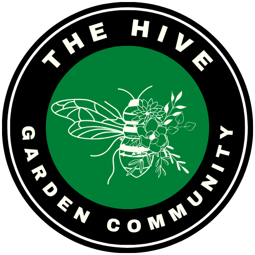
Option B: Most Popular Choice
- The font has been changed so it stands out more starkly.
- An extra ring around so it stands out against images on thumbnails eg the Garden Journal Challenge
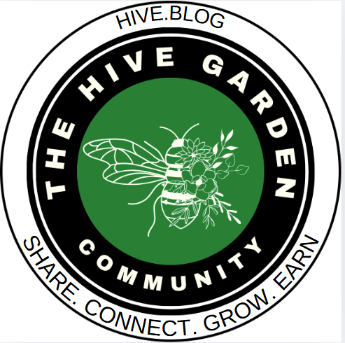
Someone also asked that the text be changed or divided so that it was easier to read. I can't decide which one works the best, so please let me know Option 1, 2, 3 or comment what you think!
### Option 1
 ### Option 2
 ## Option 3
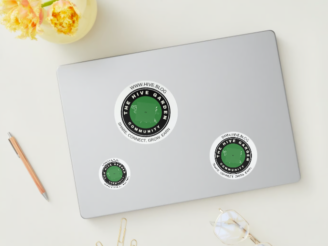
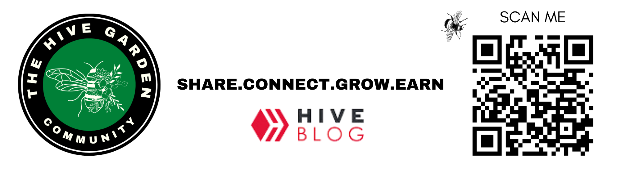
The Sticker
@akipponn will be handing out some stickers at the next Hive Creators gathering and where they can in Europe, so there's two options for these. Please let me know which one you think works the best.
STICKER OPTION 1 (CIRCLE)
STICKER 2 - RECTANGLE
Thanks gardeners for your help and for being part of our community!
# `With Love,`
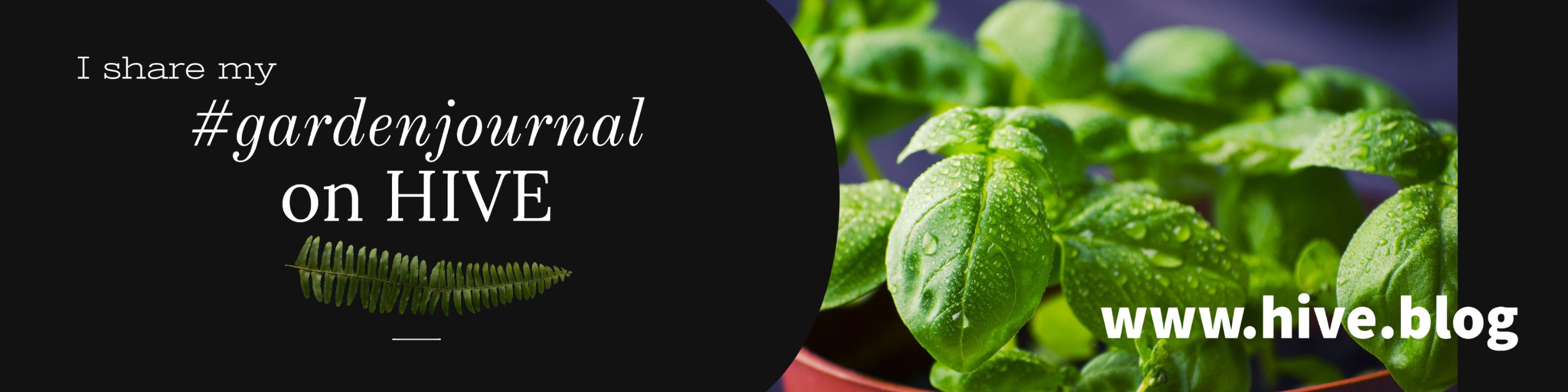
Join The Hive Garden Community! The HIVE GARDEN COMMUNITY supports gardening, homesteading, cannabis growers, permaculture and other garden related content. Delegations to the curation account, @gardenhive, are welcome! Find our community here! Are you on HIVE yet? Earn for writing! Referral link for FREE account here!