It's Sunday again, which meant it's time for another technical analysis post, let's see what our two favorite assets have been doing lately.
You may ask why am I still charting HIVE/USDT spot, when we have perp contracts available on several exchanges and it's a legitimate question. The answer is very simple. Those perp contracts are so new, they have so little historical data that I can't use them just yet.
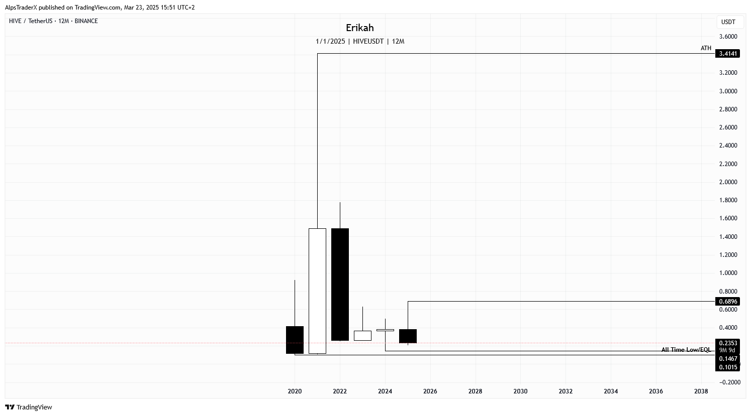
Speaking of historical data, Hive, the chain has just had its 5th birthday, so I thought I'd show you the yearly chart. I hope I don't have to tell you that the year is not over and the current candle still needs 9 more month to close.
What you're looking at above is $HIVE's history. I know some of you like to look at $HIVE with the legacy history included and count all time high (ATH) at around $8, or what was sh*ttoken worth once, but as far as I am concerned, it's time to let that part go and focus on what our chain has been able to achieve. It's been 5 years almost to the day now, enough time and data to consider it ours.
Looking at the chart, as you can see, 2021 was our best year, followed by a correction in 2022 and sideways since then.
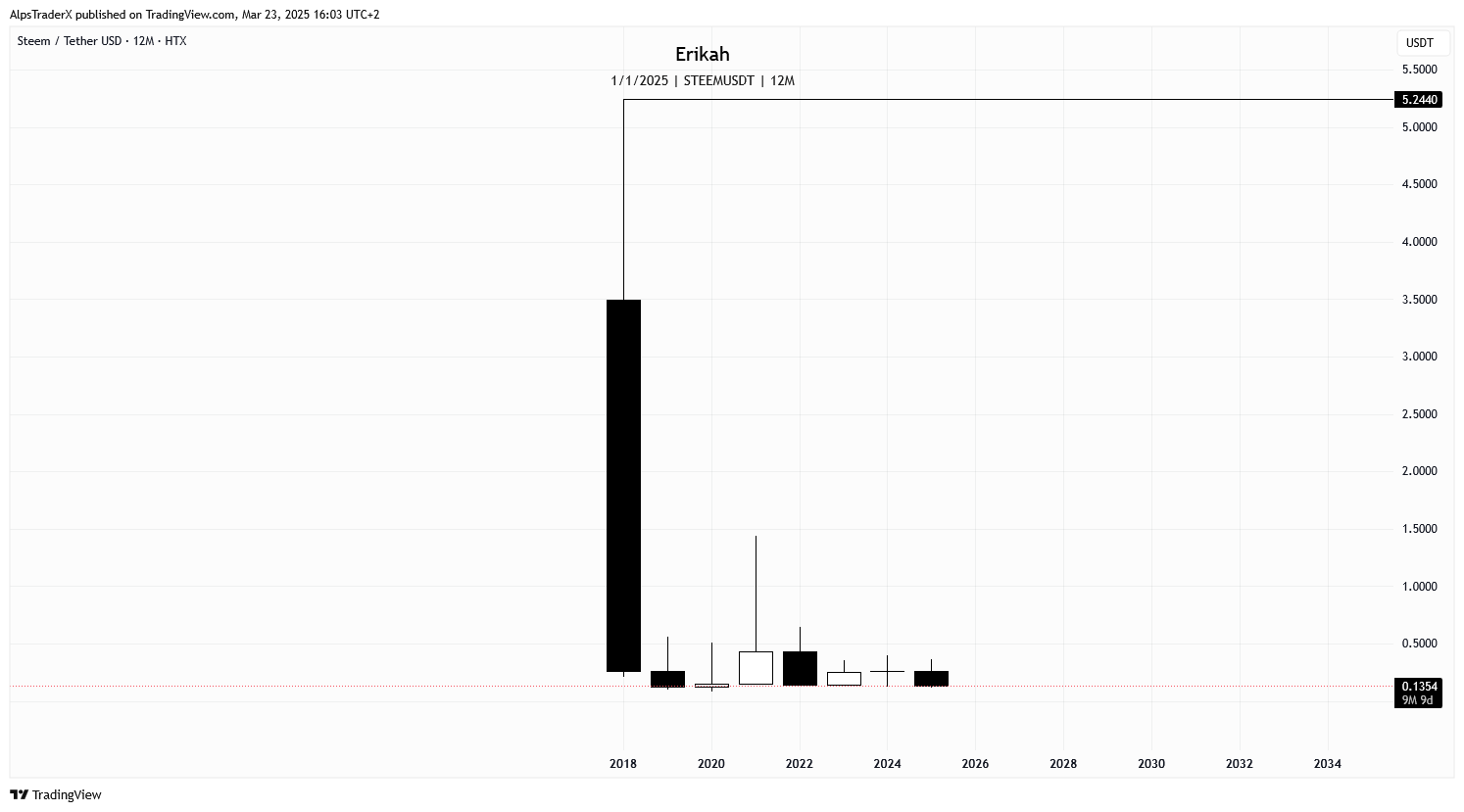
If you think $HIVE is doing bad, you should check out the chart above and see what $STEEM has been doing. I tried to find the exchange with the most historical data, but this is all I got. It's on HTX, formerly known as Huobi. I don't know where that $8 something ATH can be found, but as they say, that's ancient history.
Now, you don't have to be an expert to read this chart. Traders call this lights out and it sounds pretty accurate to me. Would you invest in a token that has been struggling for 6 years or more? I wouldn't.
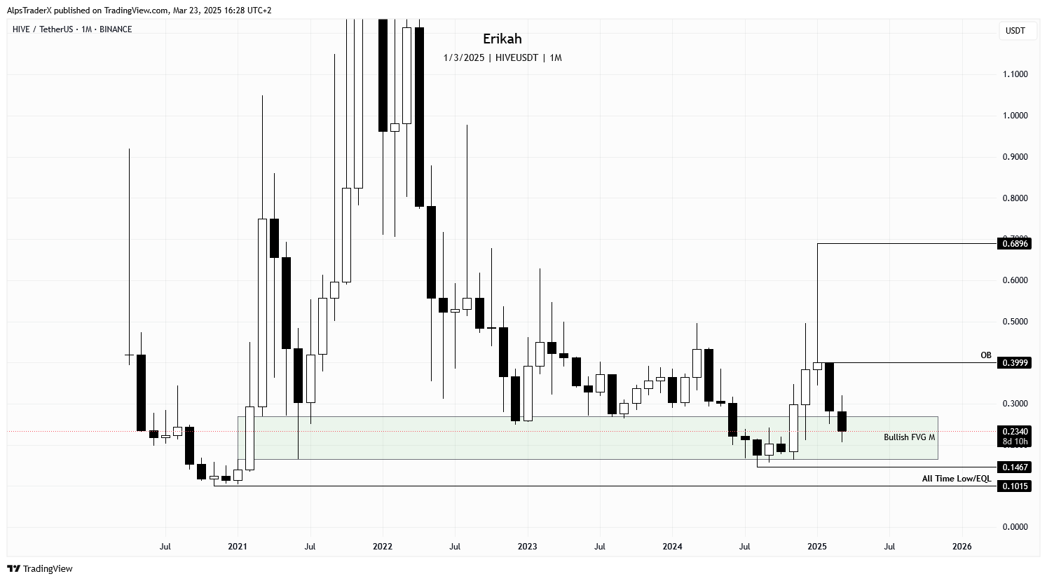
Ok, back to our business, let's see what $HIVE did on the
monthly time frame. Not much happened in the past week honestly, no major changes, so what I wrote
last week about the monthly is still valid today. I suppose we'll see more when the candle is closed.
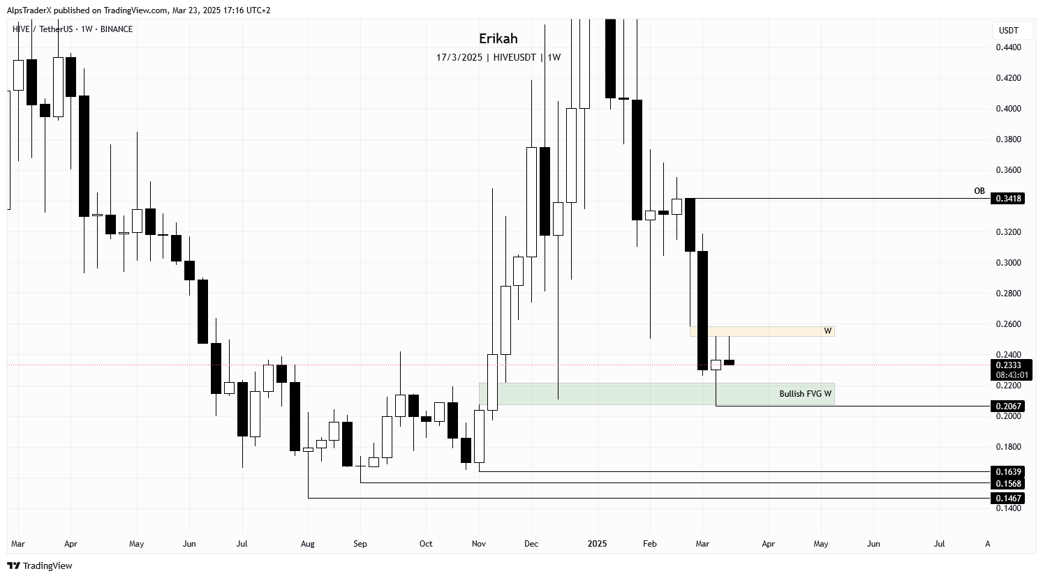
We're closing another week, with an inconclusive candle, or a bearish one with long upper wick and no lower wick. The slim bearish gap (marked with yellow on my chart) is capping the market and rejected price this week.
The bullish FVG (green box) is holding price for the moment, but in case of weakness, it's possible for price to sweep liquidity under the wick at $0.2067. In case that level is lost, $0.1639, $0.1568 and $0.1467 can be revisited again.
The daily chart doesn't look good to be honest. At the time of writing, looks like price is heading towards the liquidity resting below the wick at $0.2281, which can be swept soon. If we don't get a reversal there, then $0.2067 is next.
For bullish continuation, price needs to invert the slim bearish gap (yellow on my chart), sweep liquidity at the equal highs (EQH), close above $0.2572 and hold.
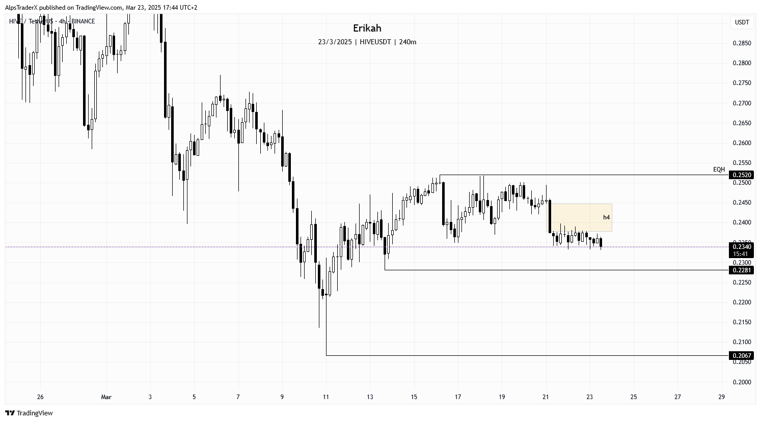
The 4h chart is pretty explicit. Price is consolidating below the bearish gap, marked with yellow on the chart (going sideways if you like), which is capping the market. At the moment of writing, sweeping liquidity at $0.2281 seems very likely. If we don't get a reversal there, I'm looking at $0.2228 to be swept next, or even $0.2067 is possible.
In case we get a reversal at some point, for bullish continuation, price needs to invert the bearish gap (yellow), close above and hold that level. As I mentioned previously in this post, we have relative equal highs (EQH) at $0.2520, which should drive price like a magnet, so if price can close above the gap, that level is next.
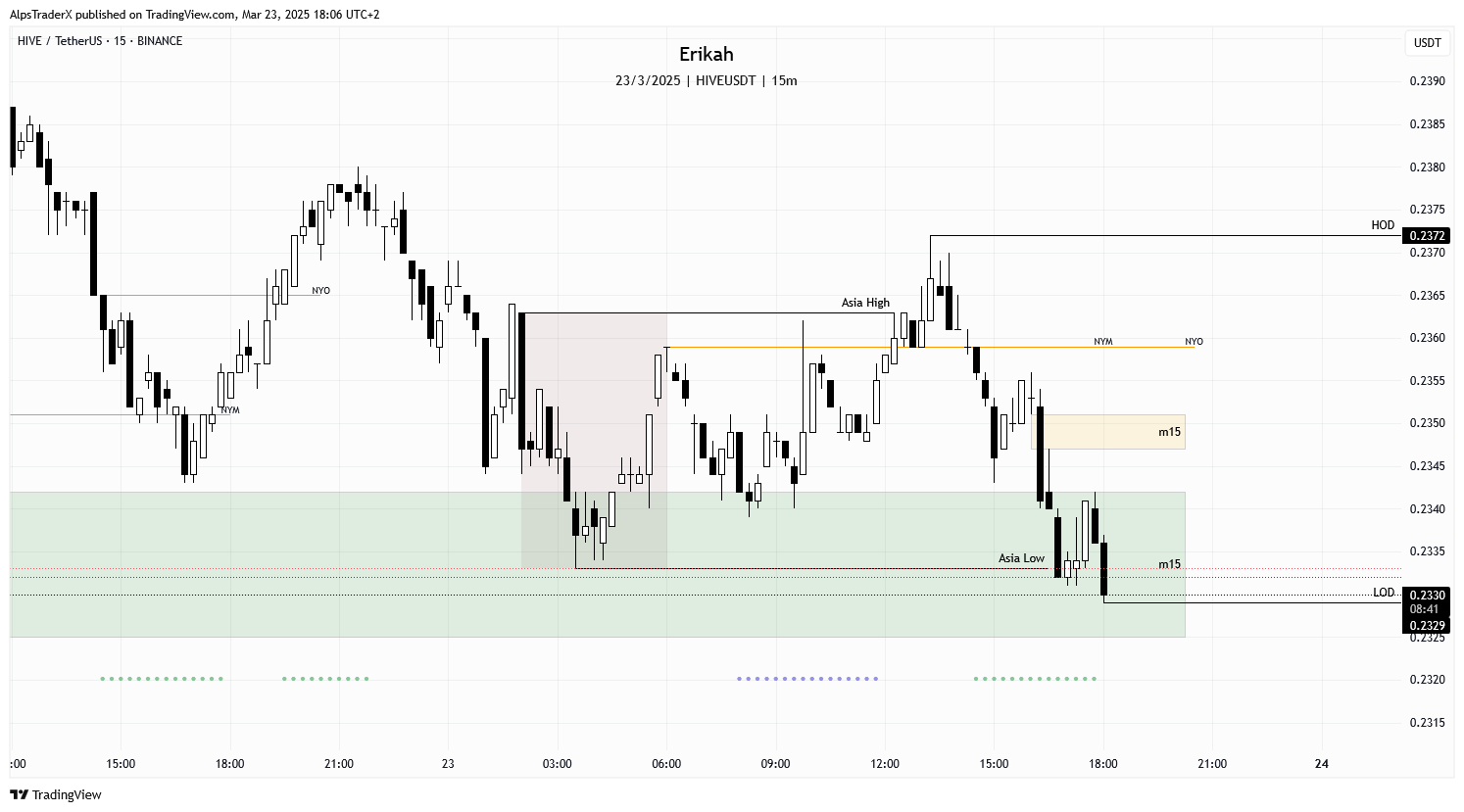
Today I'm going to do something unusual. I don't think I've ever charted $HIVE on the m15 time frame, because this is important only for those who are scalping, but today I'm going to make an exception and show you how terrible the chart looks. 😆
It hurts me to look at those volume imbalances, which makes it untradable for scalpers, but this is spot, so I wouldn't trade it anyway. Today it's Sunday , traditional markets are closed, but I still marked the Asia session as usual, which is crucial for me.
So, to cut to the chase, if the bullish gap (marked with green) can't hold price, then the levels mentioned above are next.
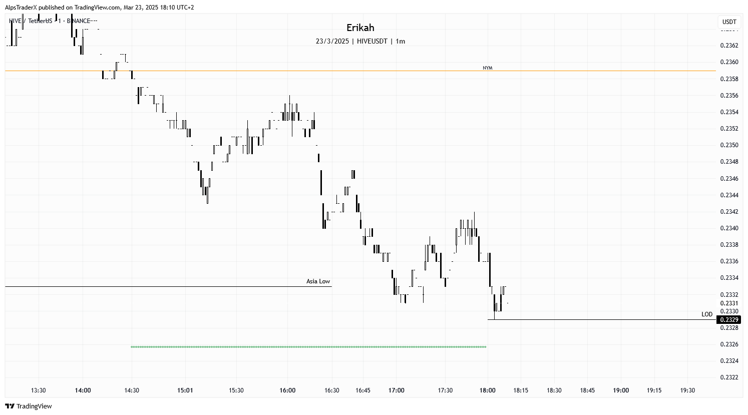
To torture myself further, I'm showing you what the 1 minute chart looks like. It's an absolute mess and shows you an illiquid asset. It's a nightmare honestly.
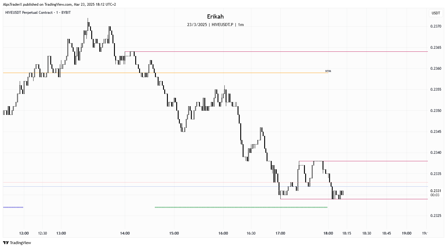
The perpetual chart on Bybit is a bit better, but still terrible, it looks very pixelated if you will and impossible to trade it 😂. Ok, this was just for fun. Let's have a look at what $BTC has been doing.
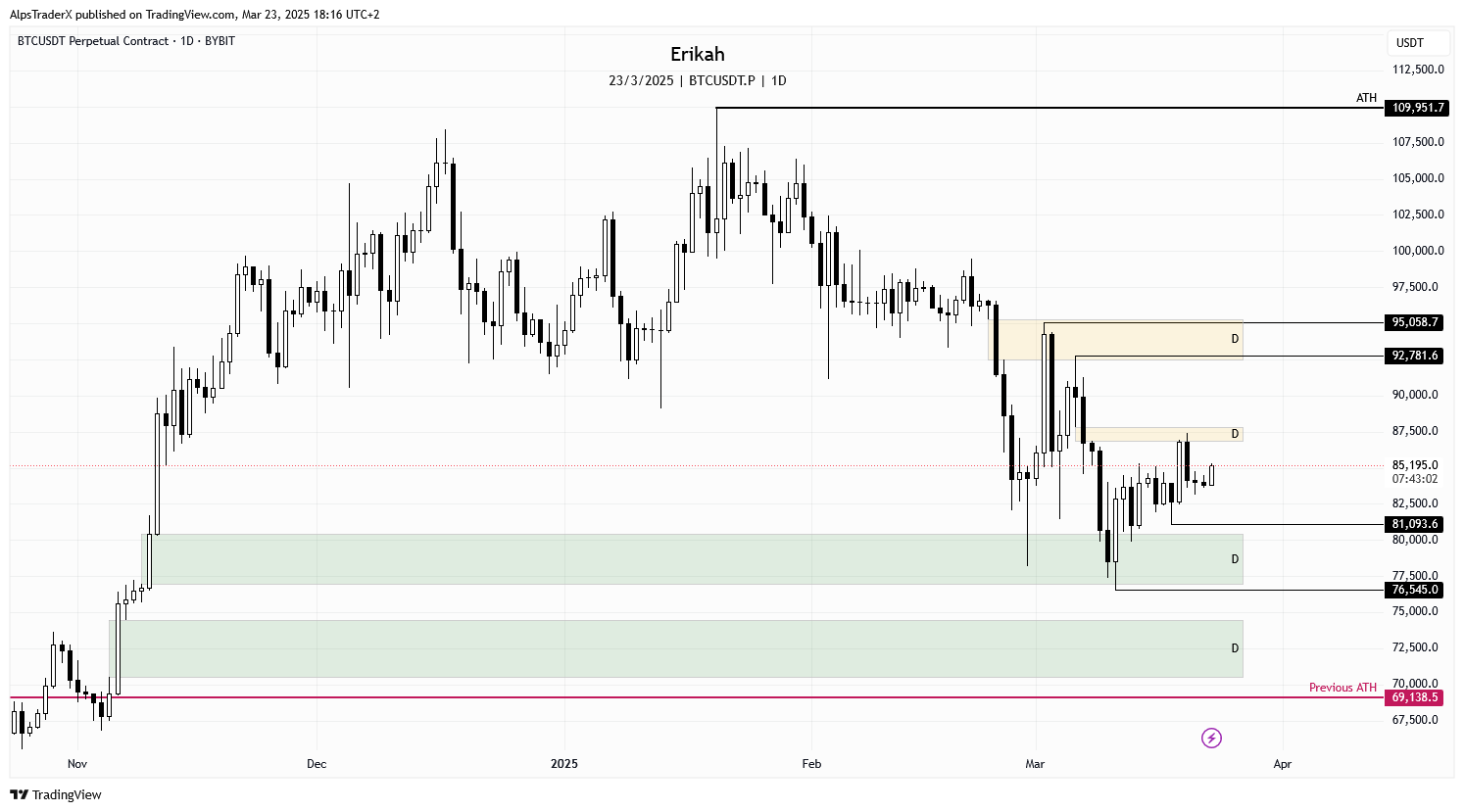
Not much happened since last week on the daily time frame honestly. Price closed above the bearish gap we had last week, but dropped back below it again, so basically what I wrote last week about $BTC is still valid.
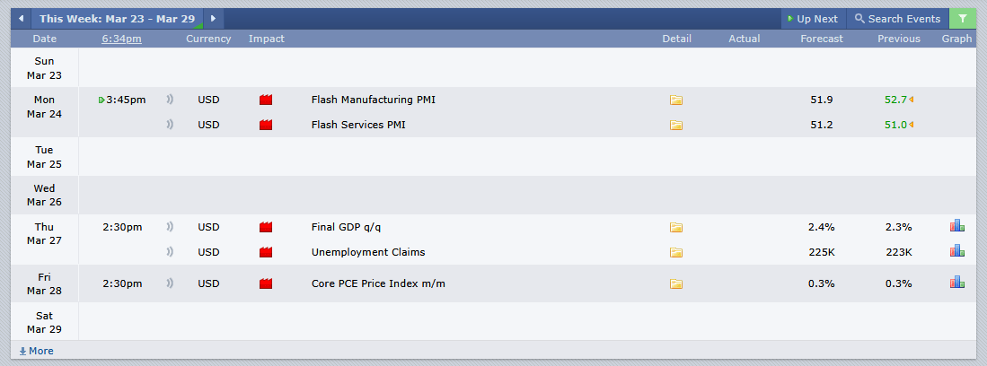
As far as the economic calendar is concerned, we have 3 red folder days next week, so it may not be the most volatile week, but then again, the events marked in the calendar are not the only ones that can move the market. With an US president like Trump, who can manipulate the markets several times per day with posts that get deleted later and speeches that are meant to do exactly that, coming out of nowhere, you can expect everything.
Remember, technical analysis is not about forecasting the price, but about reacting to what price does.
As always, this is a game of probabilities, not certainties. Also please note, this is not financial advice, it's my view and understanding of the market.
All charts posted here are screenshots from Tradinview.

If you're a newbie, you may want to check out these guides: