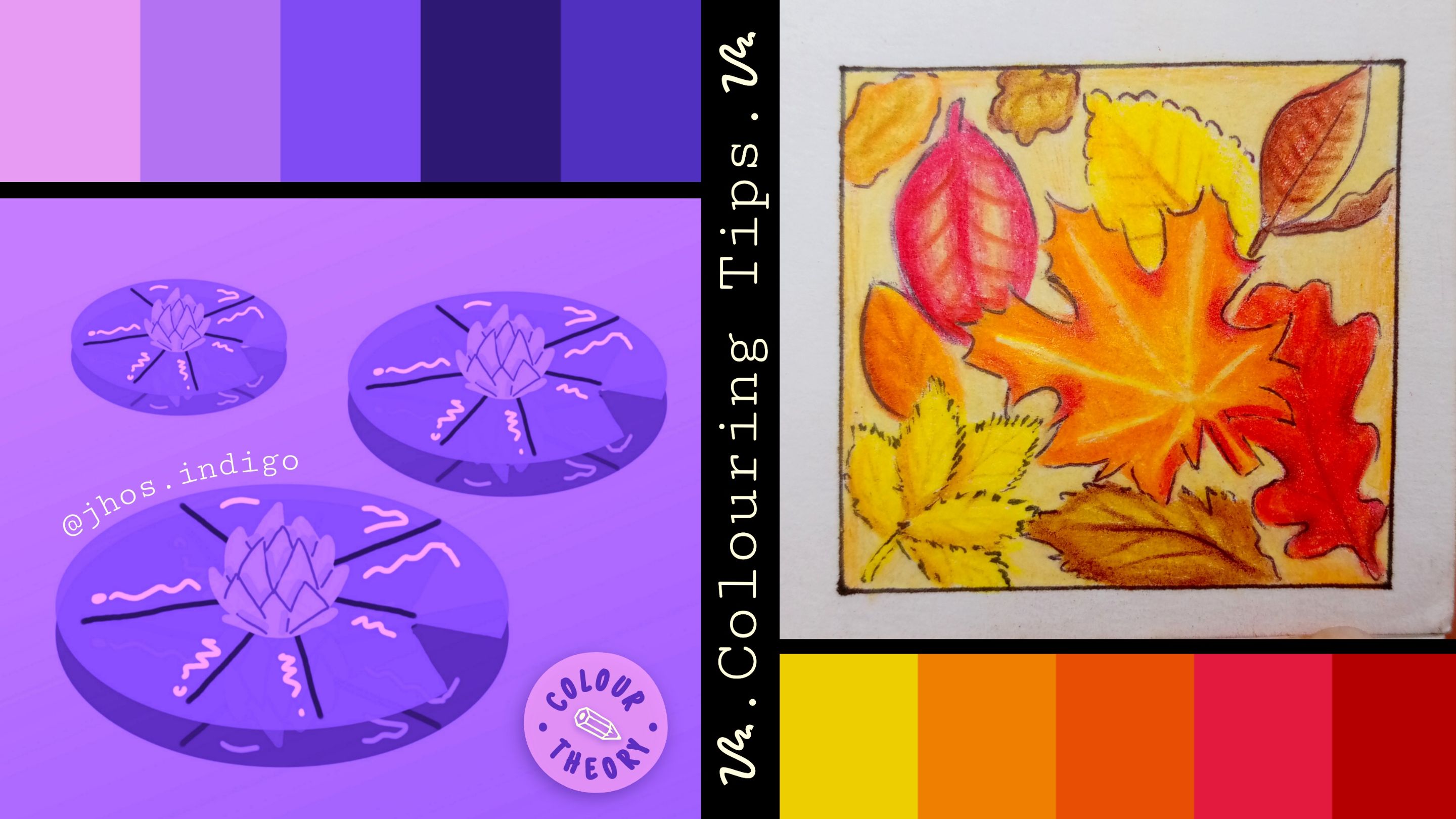
Un placer saludarlos nuevamente (cuánta formalidad). Espero se encuentren muy bien 💙✨🍁. En el capítulo de hoy de Dragon Ball Z kai... Bueno, ya. Seré seria [-⎚-⎚] (⚠︎No les prometo serlo hasta el final del post⚠︎).
It's a pleasure to greet you once again (so formal). I hope you’re all doing very well 💙✨🍁. In today’s episode of Dragon Ball Z Kai... Okay, I’ll be serious [-⎚-⎚] (⚠︎ I can’t promise to stay serious until the end of this post ⚠︎).
Pude notar que mi publicación anterior sobre "tips para colorear mejor" tuvo un muy buen recibimiento, así que hoy por fin decidí subir la segunda parte de ese post... (Spoiler, habrá 3era parte) El anterior fue suuuper básico, hablé sobre lo físico del coloreado, como los lápices de colores, la presión, las capas y todo lo demás. Si no lo vieron y quieren saber de qué les hablo, acá se los dejo:
I noticed that my previous post about "tips for better coloring" was very well received, so today I finally decided to upload the second part of that post... (Spoiler, there will be a third part). The first one was super basic; I talked about the physical aspects of coloring, like colored pencils, pressure, layers, and everything else. If you didn’t see it and want to know what I’m talking about, here it is:
Hoy en su lugar quise traer lo que le sigue, bueno, realmente creo que más que tips, esta es una sugerencia o recomendación de un tema de estudio que como mínimo hay que hojear si queremos mejorar nuestros coloreados. Ciertos parámetros o características del coloreado que me parecen muy importantes en mi estilo de dibujo, y que puede ayudar a conseguir una mejor estética en sus ilustraciones.
Today, I wanted to bring the next, well, honestly, I think more than tips, this is a suggestion or recommendation of a study topic that you should at least skim through if you want to improve your coloring. Certain parameters or characteristics of coloring seem very important to me in my drawing style and can help achieve a better aesthetic in your illustrations.
Y esto es que sí o sí les recomiendo aprender es:
And this is what I absolutely recommend learning:
🎨🌈• TEORÍA DEL COLOR • 🌈 • COLOR THEORY • 🌈🎨
El color es uno de los elementos más interesantes y complejos dentro de una obra, está presente en la mayoría de elementos que nos rodean y genera gran impacto en nosotros.
Color is one of the most interesting and complex elements within a piece of work; it's present in most of the elements around us and has a significant impact on us.
Es por ello que el color también tiene sus propiedades, y sus maneras de usarlo para obtener diferentes resultados para expresar lo que deseamos y generar distintos efectos, tanto en la obra mísma como en el espectador que la contempla.
That’s why color also has its properties and ways to use it to achieve different results, express what we want, and generate various effects, both in the work itself and for the observer viewing it.
Aquí nuestro amigo fiel va a ser la rueda de colores, también llamado círculo cromático.
Our loyal friend here will be the color wheel, also called the chromatic circle.
Puedes hacer una a mano, y de una vez practicar el mezclar los colores para obtener otros. O puedes descargar una app de rueda de color en el móvil. Yo les recomiendo esta:
You can make one by hand and practice mixing colors to get others. Or you can download a color wheel app on your phone. I recommend this one:
Pesa muy poco, es interactiva, bastante básica y simple, pero muy útil e intuitiva. Incluso da pequeños conceptos y consejos de cada cosa.
It’s very lightweight, interactive, pretty basic and simple, but very useful and intuitive. It even provides small concepts and tips about each thing.
🧮 𔓘• CLASIFICACIÓN DEL COLOR • 𔓘🧮 𔓘 • COLOUR CLASIFICATION • 𔓘
Creo que todos conocemos los colores primarios, secundarios y terciarios. Sino, aquí dejo una explicación rápida.
I think we all know the primary, secondary, and tertiary colors. If not, here’s a quick explanation.
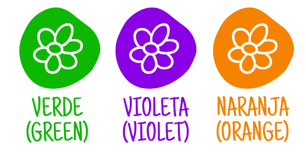
✨ • PRIMARIOS • ✨* Son los colores que no se obtienen de ninguna mezcla de color.
✨ • PRIMARY • ✨ These are the colors that cannot be obtained from any mixture of color.
✨ • SECUNDARIOS • ✨ Se obtienen de la mezcla entre dos colores primarios.
✨ • SECONDARY • ✨ They are obtained by mixing two primary colors.
✨ • TERCIARIOS • ✨ Se obtienen de la mezcla de un color primario y uno secundario
✨ • TERTIARY • ✨ They are obtained by mixing a primary color and a secondary color.
🌡️• TEMPERATURA DEL COLOR • 🌡️ • TEMPERATURE • 🌡️
Los colores se separan según la temperatura que nos trasmiten, solemos clasificarlos así porque los asociamos a ciertos elementos tangibles que sensorialmente poseen alguna temperatura.
Colors are separated according to the temperature they transmit to us. We tend to classify them this way because we associate them with certain tangible elements that sensorially possess some temperature.
❄️ • Frios: Nos transmiten reposo, calma, frescura. Solemos asociarlos al hielo, el agua y el cielo.
❄️ • Cool colors: They convey calmness, freshness, and rest. We usually associate them with ice, water, and the sky.
🔥• Cálidos: Evocan vitalidad, energía y calor, solemos asociarlos al sol, la arena y el fuego.
🔥• Warm colors: They evoke vitality, energy, and warmth. We tend to associate them with the sun, sand, and fire.
🎨🧠 • PSICOLOGÍA DEL COLOR • 🧠🎨• COLOR PSYCHOLOGY • 🧠🎨
Los colores pueden evocar distintas reacciones y sensaciones, incluso pueden dirigir, estimular o sugestionar al espectador dependiendo del contexto. Además de expresar distintas cosas. Acá les dejo un ejemplo de las cosas que se dice que expresa o transmite cada color.
The colors can evoke different reactions and sensations. They can even guide, stimulate, or influence the viewer depending on the context.
📊 • CARACTERISTICAS DEL COLOR • 📊• COLOR CHARACTERISTICS • 📊
El color tiene variaciones, parámetros que alteran su estado puro y nos dan más posibilidades de aplicaciones.
Color has variations and parameters that alter its pure state and give us more possibilities for applications.
💥 • Saturación • 💥: ️ Si el color es más, o menos vibrante.
💥 • Saturation • 💥: ️ Whether the color is more or less vibrant.
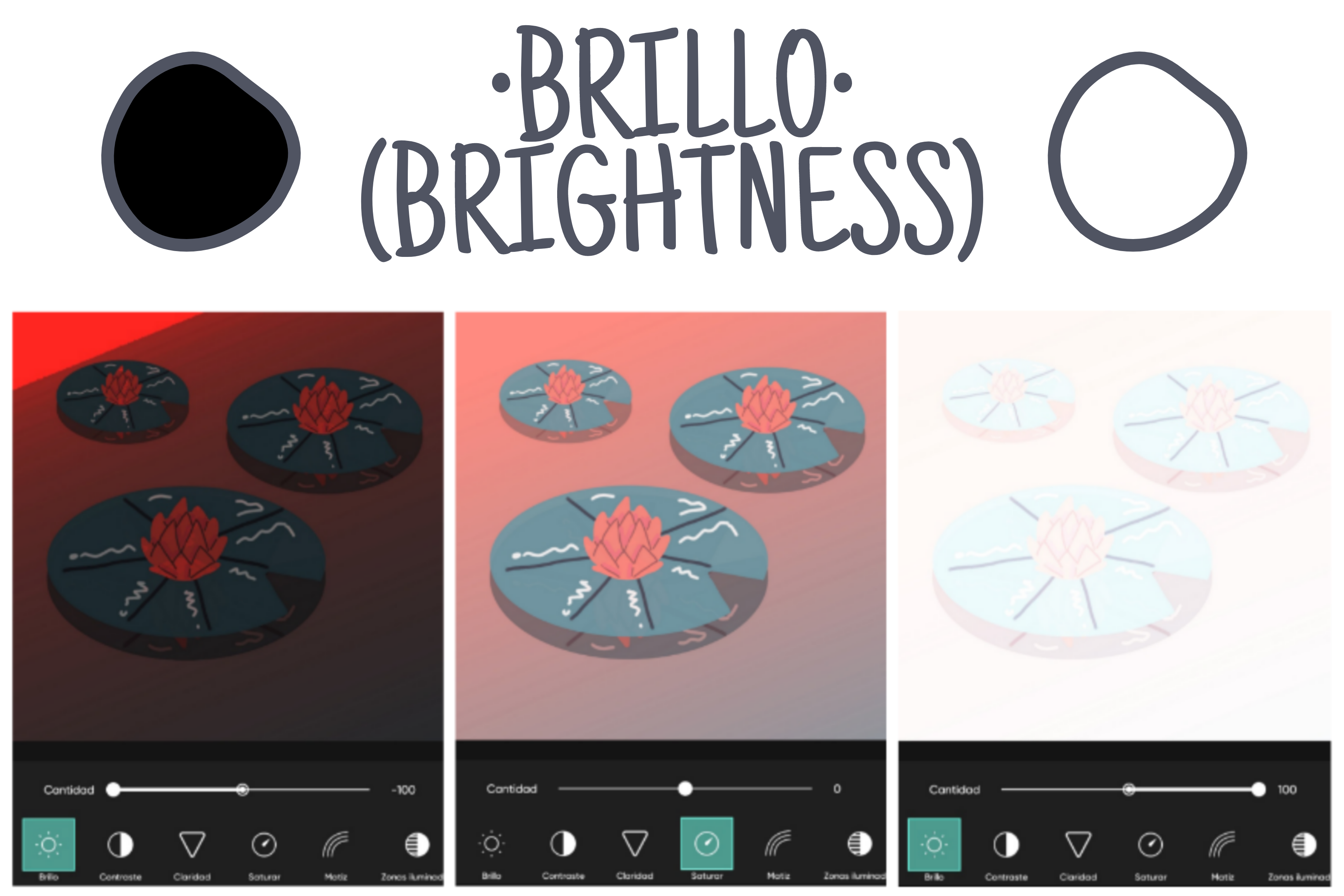
☀️• Brillo o valor • ☀️: Qué tan cerca del negro o el blanco está el color, mientras más blanco tenga el color más brillante es, y mientras más negro: más oscuro.
☀️• Brightness or value • ☀️: How close the color is to black or white. The more white a color contains, the brighter it is, and the more black it contains, the darker it is.
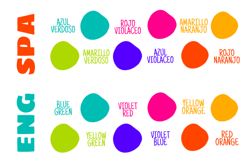
🌈 • Tono • 🌈: Se refiere a la ubicación del color dentro de la barra o rueda de colores. Los tonos suelen definir cuándo un color tiene un porcentaje de otro color. Por ejemplo: Verde azulado o amarillo verdoso.
🌈 • Hue • 🌈: Refers to the position of the color on the color bar or wheel. Hues often define when a color has a percentage of another color. For example: Blue-green or yellow-green.
Honestamente lo demás me aburre, esta parte sí me encanta. Si eres fan de las combinaciones y paletas de colores visualmente atractivas y estéticas, este tema definitivamente te interesa, cariño mío.
Honestly, this is the topic I wanted to get to—the rest kind of bores me. But well, sometimes it’s necessary to learn the "boring" part first so we can have fun later. If you love color combinations and visually aesthetic palettes, this topic is definitely for you, my dear.
Las armonías del color son reglas o métodos para combinar los colores, que podemos aplicar en un dibujo para tener más posibilidades de obtener resultados visualmente agradables o atractivos, o sencillamente para obtener un efecto en particular.
Color harmonies are like rules or methods of combining colors to get visually pleasing or attractive results, or simply to achieve a particular effect.
Para trabajar con las armonías del color, usaremos como guía la rueda del color.
To work with color harmonies, we’ll use the color wheel I mentioned earlier as our guide.
────**⋆⋅𓂃˖˳·˖ ִֶָ ⋆💜 • MONOCROMÁTICOS • 💜 • MONOCHROMATIC • 💜⋆ ִֶָ˖·˳˖𓂃 ִֶָ⋅⋆ ────**
---
Es cuando usamos un mismo color, variando sólo su valor (ya sea más claro, o más oscuro).
This is when we use a single color, only varying its value (whether it’s lighter or darker).
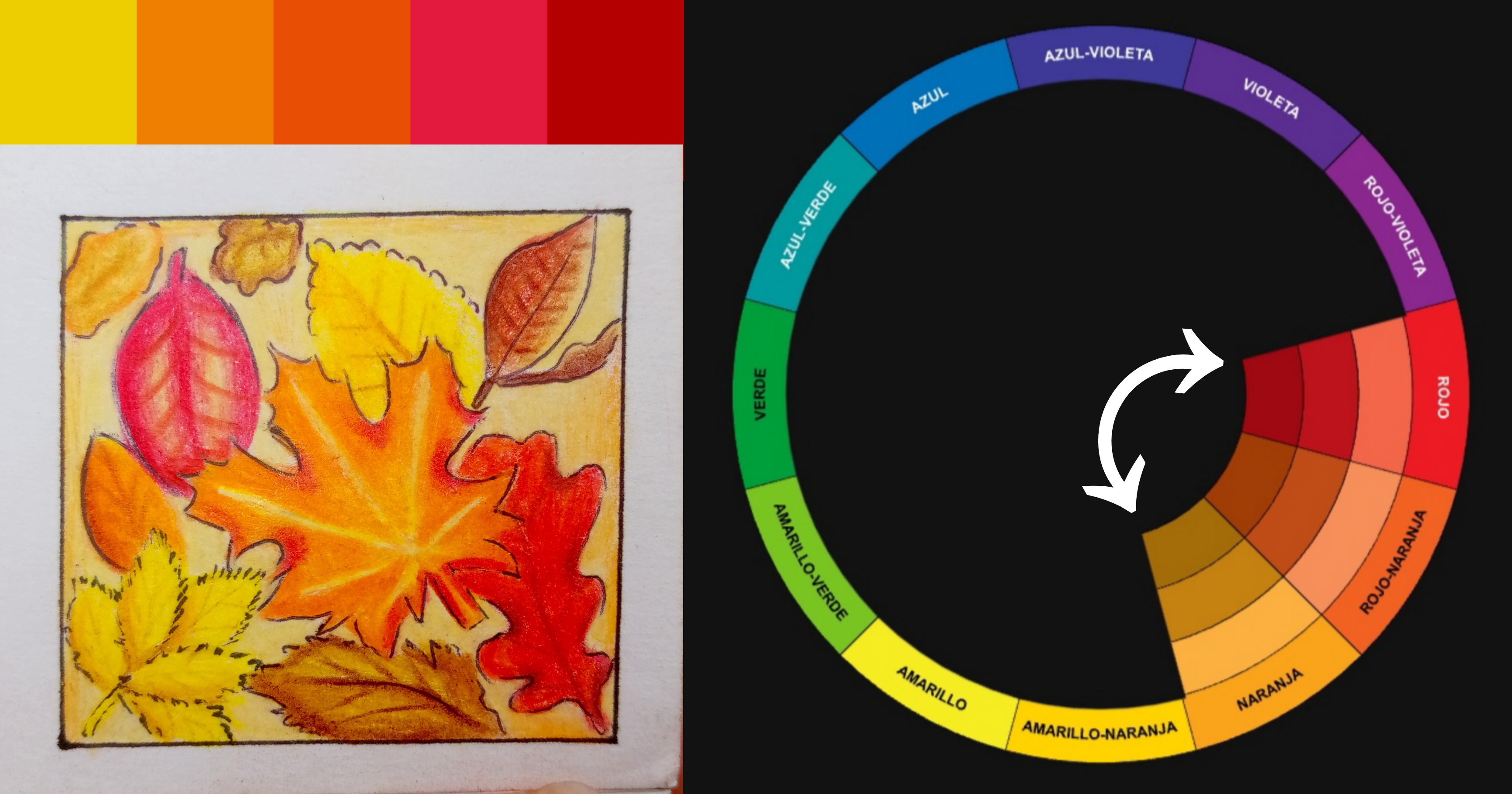
────**⋆⋅𓂃˖˳·˖ ִֶָ ⋆🍁• ANÁLOGOS • 🍁• ANALOGOUS • 🍁͙⋆ ִֶָ˖·˳˖𓂃 ִֶָ⋅⋆ ────**
---
Elegimos un color base y usamos los colores que están a los lados en la rueda de colores.
We choose a base color and use the colors found right next to it on the color wheel.
**────⋆⋅𓂃˖˳·˖ ִֶָ ⋆🌷 • COMPLEMENTARIOS • 🌷 • COMPLEMENTARY • 🌷⋆ ִֶָ˖·˳˖𓂃 ִֶָ⋅⋆ ────**
---
Usamos el color opuesto o enfrente (180°) en la rueda de color. Este es de los más comunes y fáciles, pero también de los más geniales, podemos obtener resultados muy guapos con esta armonía.
We use the color opposite (180°) on the color wheel. This is one of the most common and easy methods, but also one of the most striking. You can achieve amazing results using this harmony.
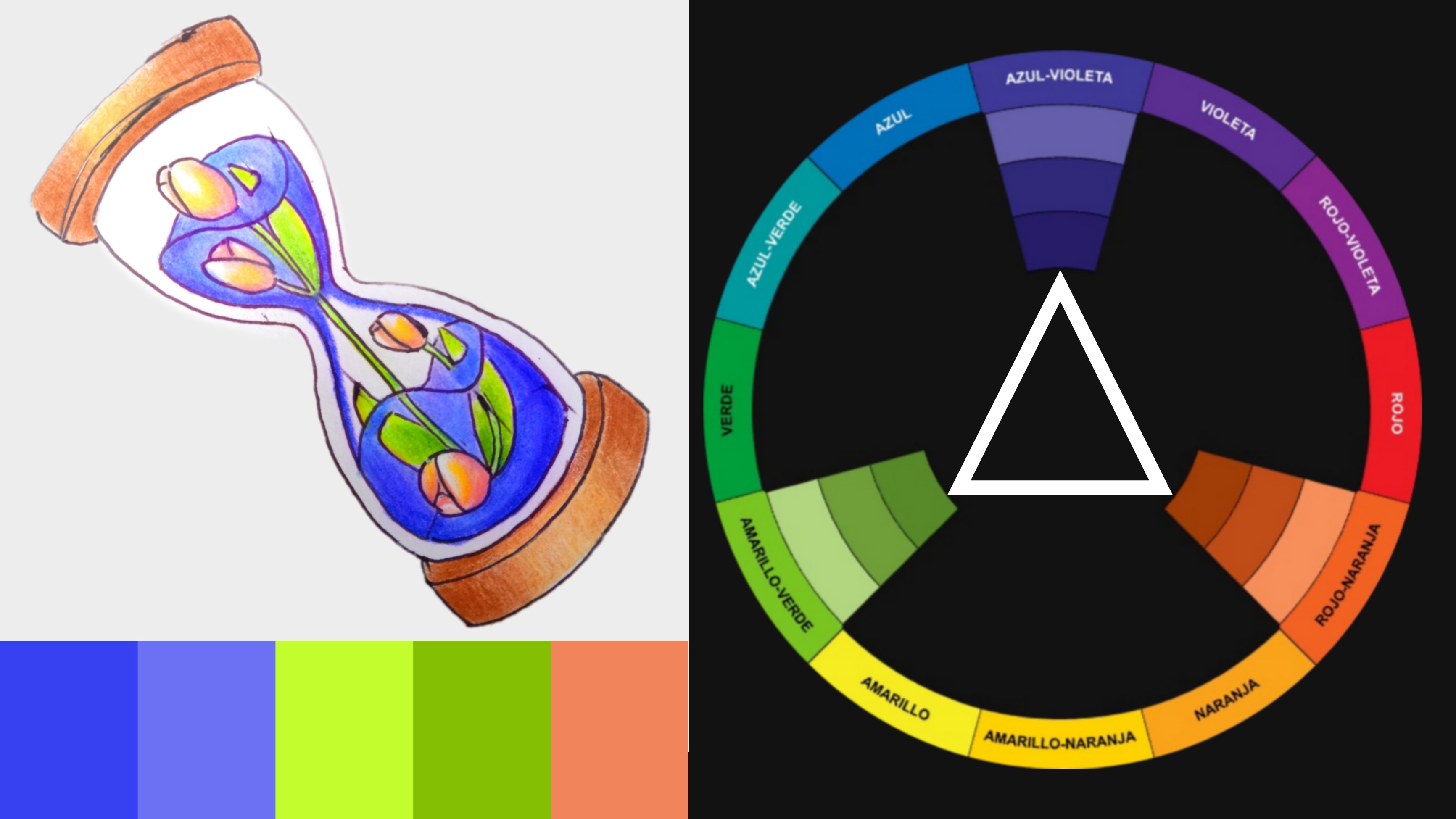
**──── ⋆⋅𓂃˖˳·˖ ִֶָ ⋆⏳ • TRIÁDICOS • ⏳ • TRIADIC • ⏳⋆ ִֶָ˖·˳˖𓂃 ִֶָ⋅⋆ ────**
---
Trataremos un triángulo en medio de nuestro círculo cromático y los colores que toquen sus puntas serán los que usaremos para aplicar a la ilustración.
We form a triangle inside our color wheel, and the colors at its three points will be the ones we use in the illustration.
Existen incluso más esquemas o armonías de color, pero sí las digo todas, no terminaré hoy.
There are even more color schemes or harmonies, but if I list them all, I’ll never finish today.
En esta oportunidad quise hacer la clase un poco más digerible, por lo que traté de no extenderme más de la cuenta.
I wanted to make this lesson a bit more digestible, so I tried not to go on longer than necessary.
Probablemente, la 3era parte la dedique meramente a ejercicios y consejos prácticos para aprender a aplicar la psicología, temperaturas y armonías del color en sus dibujos. ✨🍁 Así que les aconsejo que estén al pendiente.
I will probably dedicate the third part entirely to exercises and practical tips for learning how to apply psychology, temperature, and color harmonies in your drawings. ✨🍁 So I recommend keeping an eye out.
Dicho esto, eso sería todo por el post de hoy muchachos.
That said, that’s all for today’s post, guys.
***¡¡Mil gracias por tomarse el tiempo de leer mi post ~💙🍁✨ Hasta la próxima!! 🤗***
***Thank you so much for taking the time to read my post ~💙🍁✨ See you next time!! 🤗***
◈ **Todas las imágenes me pertenecen - Fotografías de mi autoría tomadas con un Redmi 9C.📱**
◈ **Edición de imágenes - Image editing** ➼ [PicsArt](https://play.google.com/store/apps/details?id=com.picsart.studio)
◈ **Traducción al inglés - English translation** ➼ [Chat GPT en Telegram](https://t.me/GPT4Tbot)