Small Talk
Hello everyone! How are you today? It's been good here. I had a very lack of sleep while doing this art, I am not sure why, but for better or worse, I think it helped push that last juice for me to be satisfied.
This one was very special and fun. I tried a lot of things and some sticked out. Another thing I discovered while in the making of this one will be used and shown on the next art so I hope you look forward to that.
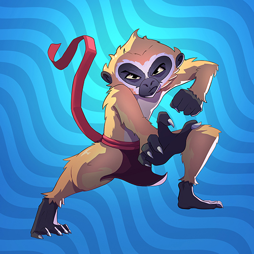
So, after 40 hours of no sleep (no exaggeration), let me show you my version of Eternal Gibbons, Splinterland's legendary reward unit.
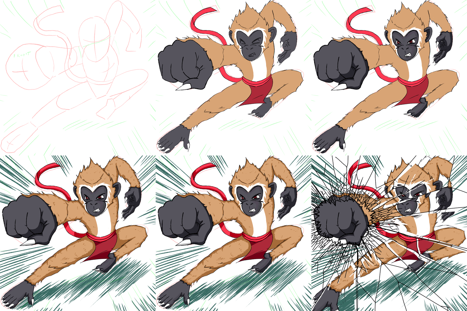
Drawing Process
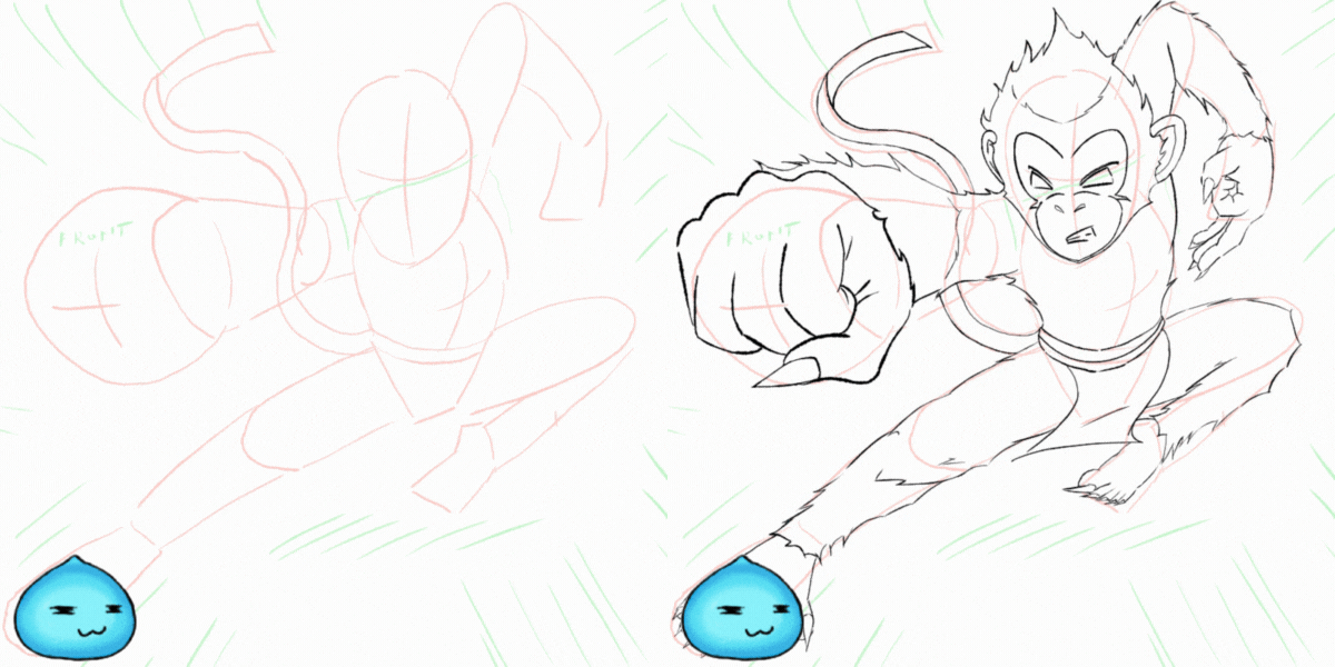
Guide and Lineart
For the Lineart, I found this cute monkey, Eternal Gibbons, that is reminded me of Jackie Chan. I think he's fairly easy to draw and practice with since I have some ideas I want to apply.
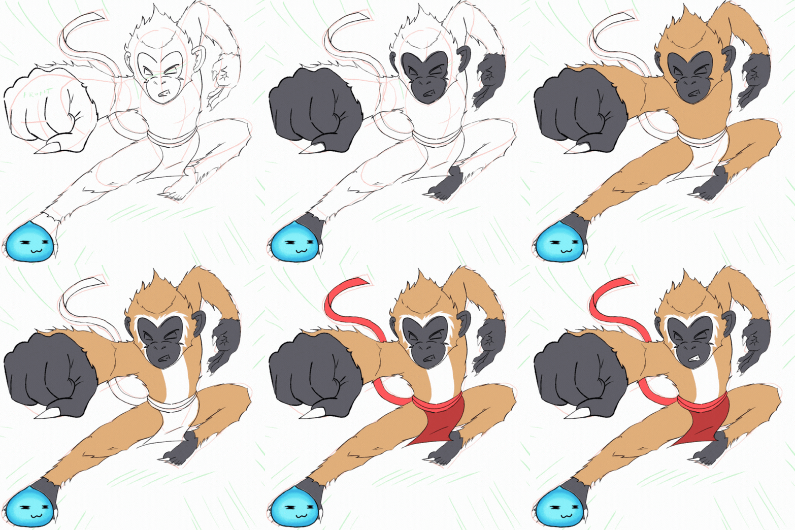
Applying Base Colors
Starting now, unless it's something I wanted to highlight on, I'll just put applying every base color in one step. This is the easiest step.
Using Eyedropper tool, import a copy of Eternal Gibson's original drawing and use that as your guide for color and apply them to the appropriate sections.
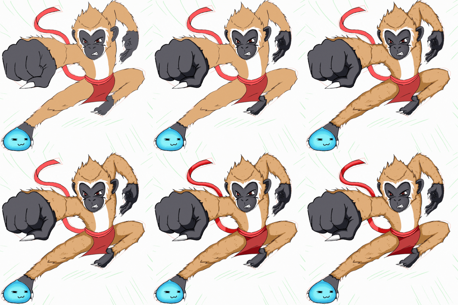
Applying Shadows
Just like the application of base colors, I'll just combine all the shadows as well in one step. This one is less complicated than other art.
Use the Eyedropper Tool, adjust sliders to a darker shade. If you don't know part, you can refer to my previous
Arkemis the Bear art, Krita has a better and easier way to do this than other drawing programs
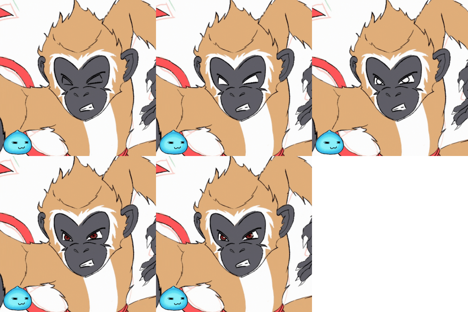
Eyes
For the eyes, since it didn't took a long time, I added both the base color and shadows on one step. The eyes are quite far to create a more detailed eye.
Speedlines Background
I already did this before with my drawing of
Arkemis the Bear. I've done it with more intent and care this time instead of one final desperate move since everything is not working.
I was bored of the normal shadows beneath the character so instead, let's try a speedline shadow as well. I think this worked well and I might apply this instead in the future
This was the original end of what I planned for this art but I wasn't still satisfied and the coffee in my veins are still running so I attempted another effect.
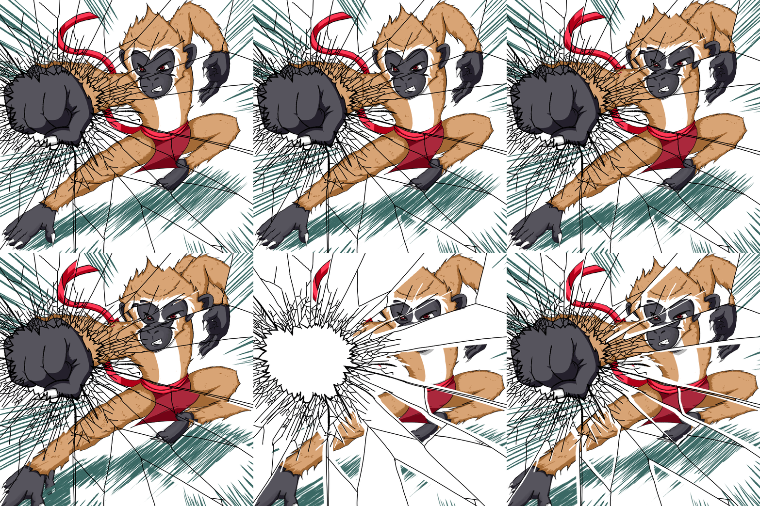
Broken Glass Effect
For the lineart of the broken glass, I used
FourN Drawing's video as a guide. Once you're done with the line art, you'd do these steps:
- (You can skip this first step but I suggest you don't) Backup all your lineart and colored layers and shadows of the main art. Using that back up, merge all the layers of line art and shadows. Do not include the Broken Glass Line art layer.
- Select the broken glass lineart layer. Use Magic Wand Tool to select one section of the broken glass.
- Select the Merged Backup Layer then right click and select "create a new layer via selection." In Photoshop, this is the same as "create new layer via cut"
- Select that new layer (rename it if you want) then press "Ctrl + T" to do a free Transform. With this, you can skew, distort or rotate. Do just that to make it out of focus. (In Krita, holding ctrl key while dragging the edges can make you rotate the layer in 3D which is cool)
- Make sure you select the new distorted layer again and then erase any parts of that one that is outside the glass section it originated from.
- Repeat steps 2-6 until you have multiple broken pieces of layer recreating the idea.
- Hide all the other layers except for the broken glass lineart, merged layers and the other layers you cut from the merged layers to show the final effect.
I am really proud of this effect because I did not use a guide or see this from somewhere. This is a trial and error and one of those "What if I do this" situation that worked really well. I could even claim it as an original effect.
Full Timelapse
Original Art
Art Direction
For this art, and maybe other future and ongoing art, I will be using a two-colored drawing style. Apply the base art and apply a shadow. This is not because I'm lazy or anything but because the 3 colors and the one with the gradient using the specific pen, it doesn't really work with my style.
I'll still practice them and apply it once in a while like what I did on the eyes of this drawing but I'll do it very seldom. I'd rather upload something good in the eyes than a messy experiment.
I also think it works quite a bit for me. The simpler, the better as they say. I think Food Wars' Akira Hayama said it better, "In some dishes, especially with aromatic spices like curry, adding more flavor doesn’t always make the dish better. Sometimes, it dulls the impact of the central aroma."
In my style, adding more and more colors or shade or style which I haven't had a good grasp on can just ruin my work instead of improving them. So, it would be better to make it simple for now as I do a taste test during practice on how to improve my style instead of forcing it on my uploads.
Hi, y'all. Slimey here, your jolly and gullible little blue slime. I got reincarnated to this world to better my art and join community challenges to get more practice and improve my skill.
Know more about me by checking out my
introduction postSupport me by joining Splinterlands using my
referral code.
Images are taken from Splinterlands, Drawn in Krita, Animated in Photoshop and Edited in Canva.
