
Repository
This Project is can be fond in Github
Linked Task Request
Project FPL PLUS LOGO was open a Task Request
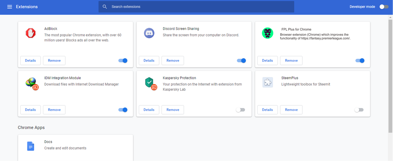
What is FPL PLUS.
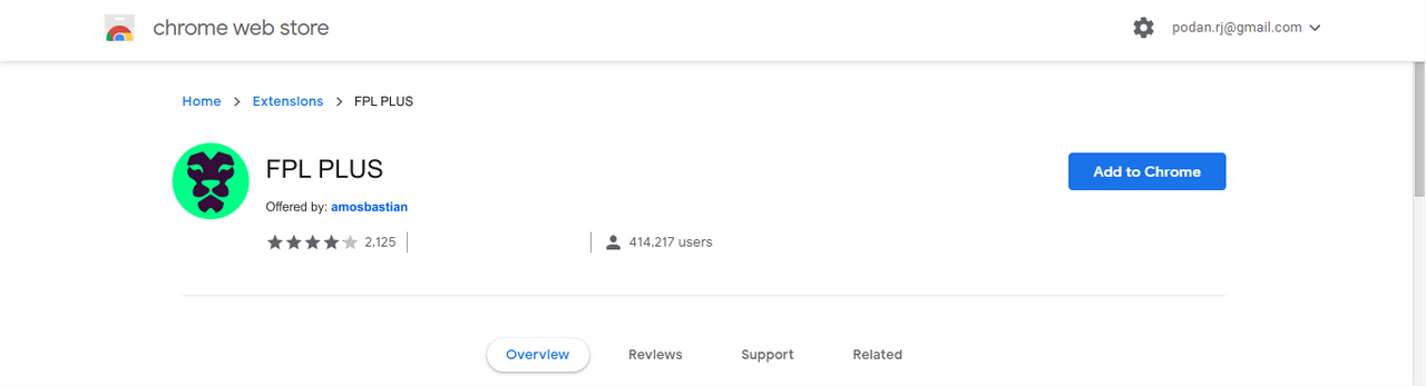
FPL Plus is a browser extension for the website https://fantasy.premierleague.com/. You can read more about FPL PLUS is HERE https://github.com/amosbastian/fpl-plus.
What is the idea of LOGO FPL PLUS.
As usual, to reach the target users about digging up information on projects related to each other, I made a logo concept that has the same character as the Fantasy Premier League logo.
Below is an idea FPL PLUS LOGO.

As you can see, the main target of this logo must have the same characteristics, namely Negative Space.
And then i come up with a diffirent style variation to reach out the Project Owner. Here is a different style variation.
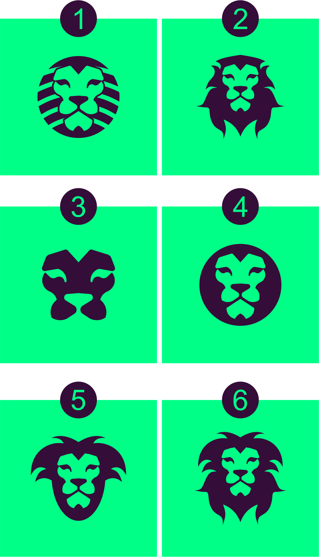
As the result of decission, Project owner will take number 4 to be FPL PLUS LOGO.

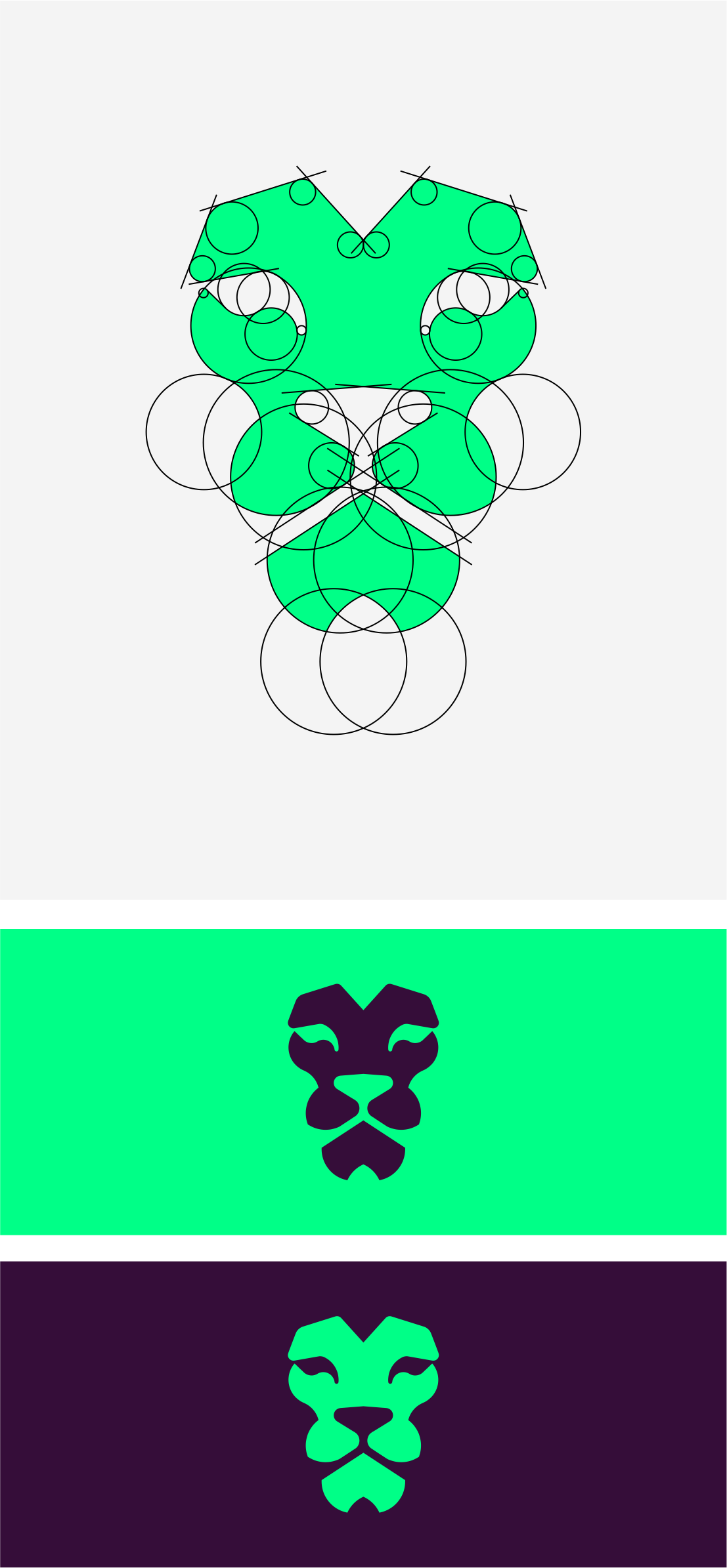
Logo Process
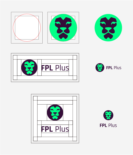
Logo Result
In the left is the main logo model or primary logo design. This logo is the master logo. meaning this logo is a concept that should be used in everywhere.and then in the right is the secondary logo. This logo is for use when the main logo is not suitable for use. for example for use in the website.
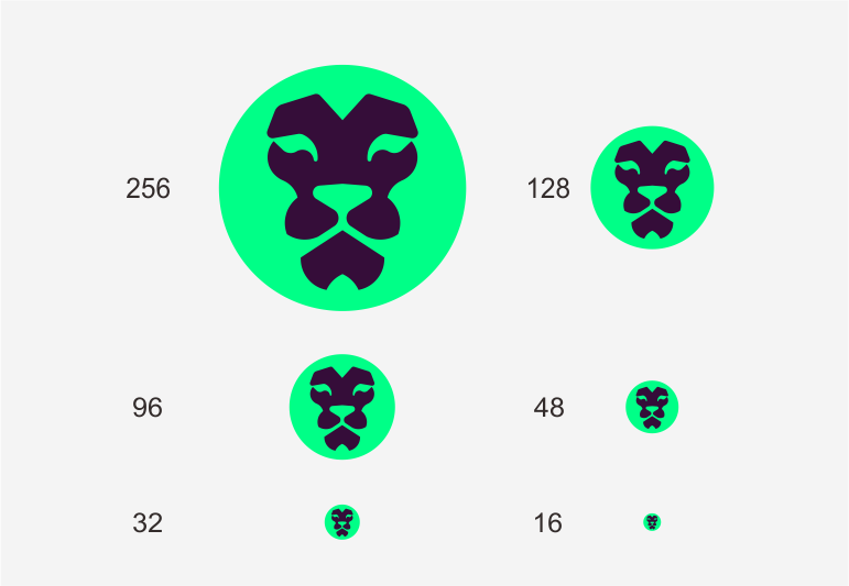
And here is icon version or logomark.This logo aims to use in social media and icon in an app.
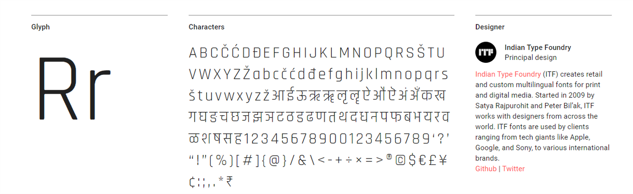
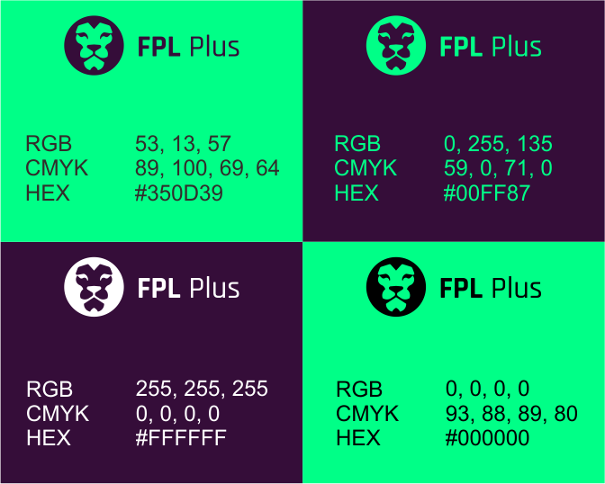
Font Used for typography is font RAJDANI and Colour used in a logo is the following below.
Benefit
As for the benefits of this logo design are:
Logo design is a type of LogoMark and Logotype with combination and visualisation.
This logo design is based on Grid Line, aiming to keep the design balance. Grid Line is an important thing in logo design. Logo is expected not only to have a beautiful concept, but how to keep the stability in the formation of the logo. GridLine has the power to describe a logic, theory and control of balance in design.
Simple and minimalist LogoMark that is easy to understand by audient.
Logo created in the style of Fundamental Geometric shapes. this is every advantage in the design that I create, I tend not to recognize the importance of typography, I tend to choose to create minimal geometry or geometry with deep feelings in a design. when you see you will know branding versatility, easy readability, and instant impact on the created visuals.
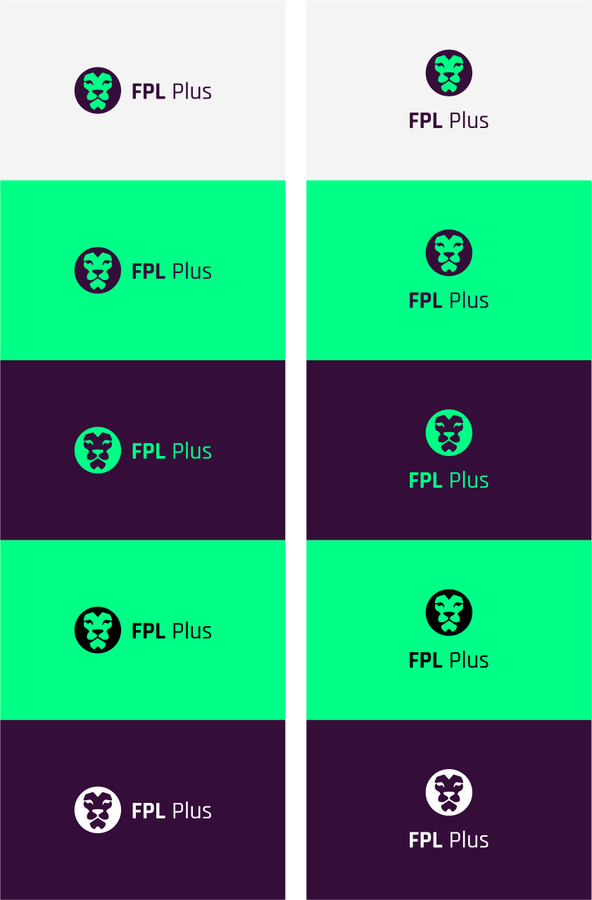
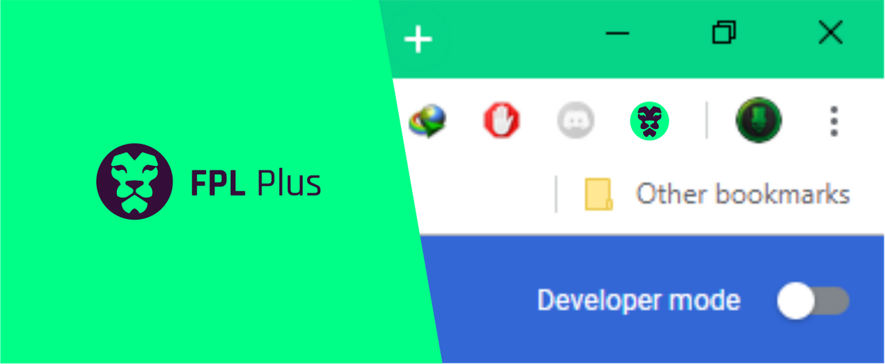
These are some view when the logo is used.
Proof of authorship
Some screenshots can be found here.
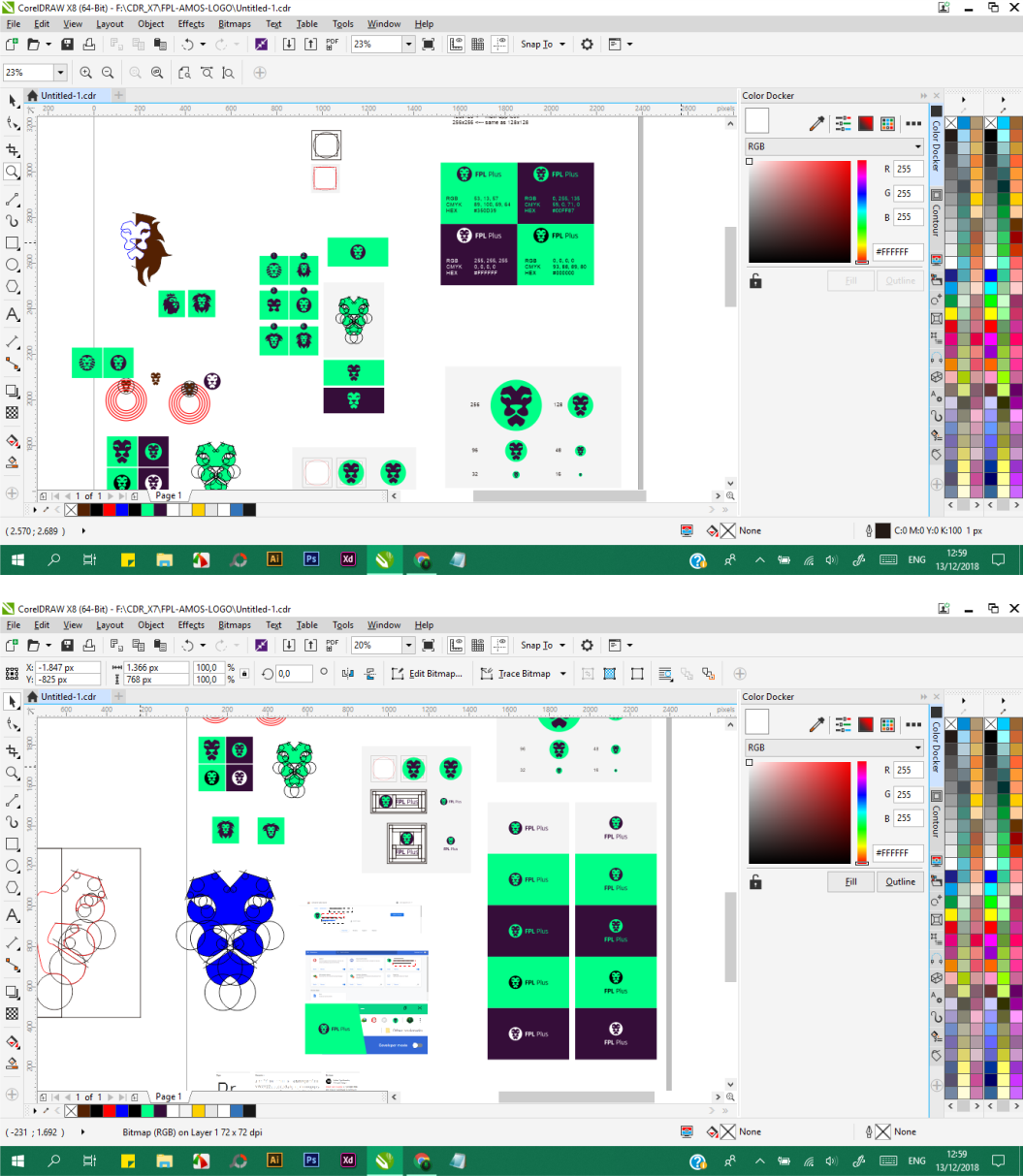
Tools
I created this design using CDRx8. And I provide a vector file ( SVG, PDF ) for flexibility and scalability, as well as .PNG file format for immediate use of the designs.
Original files
Donwload File Here :
FONT
LOGO ASSET
License

This work is licensed under a Creative Commons Attribution 4.0 International License.