Repository
Linked Task Request
Details
My task was to submit logo design concepts for
@MeraSteem. My challenge for myself was to submit a concept using a single, easily recognizable mark, that delivers a clear message based on the business's core values.
MeraSteem is a project that helps businesses by providing resources to get them off of the ground. In other words, MeraSteem acts as a launchpad for new ideas. To symbolize this, the icon is modeled after the image of a rocket.
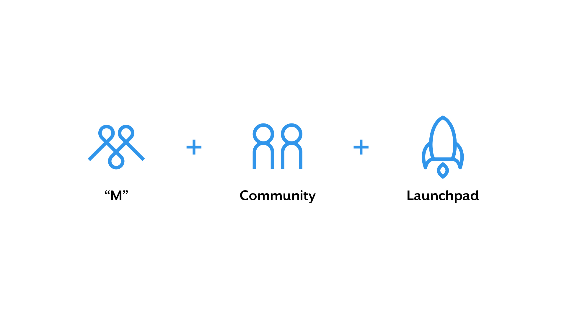
This design delivers three different meanings. The first is a "M", for Mera, hidden inside the image; the second, two heads inside of the ship to represent community; and lastly, as mentioned before, a rocket to symbolize propelling new ideas and businesses.
Primary Color System
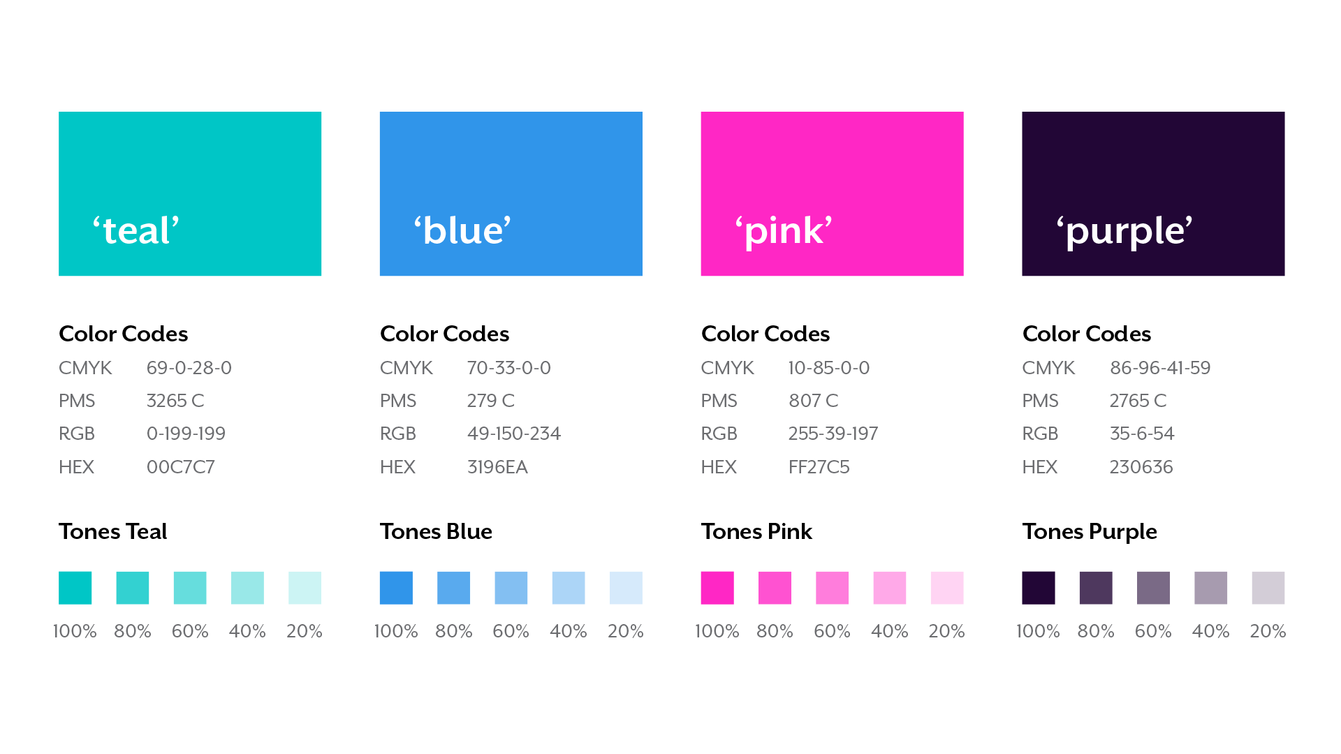
Color plays an important role in the MeraSteem identity program. The colors below are recommendations for various media. A palette of primary colors has been developed, which compromises the color scheme. Consistent use of the colors will contribute to the cohesive and harmonious look of the MeraSteem brand identity across all relevant media. Check with your designer or printer when using the colors so that they will always be consistent.
Gradients
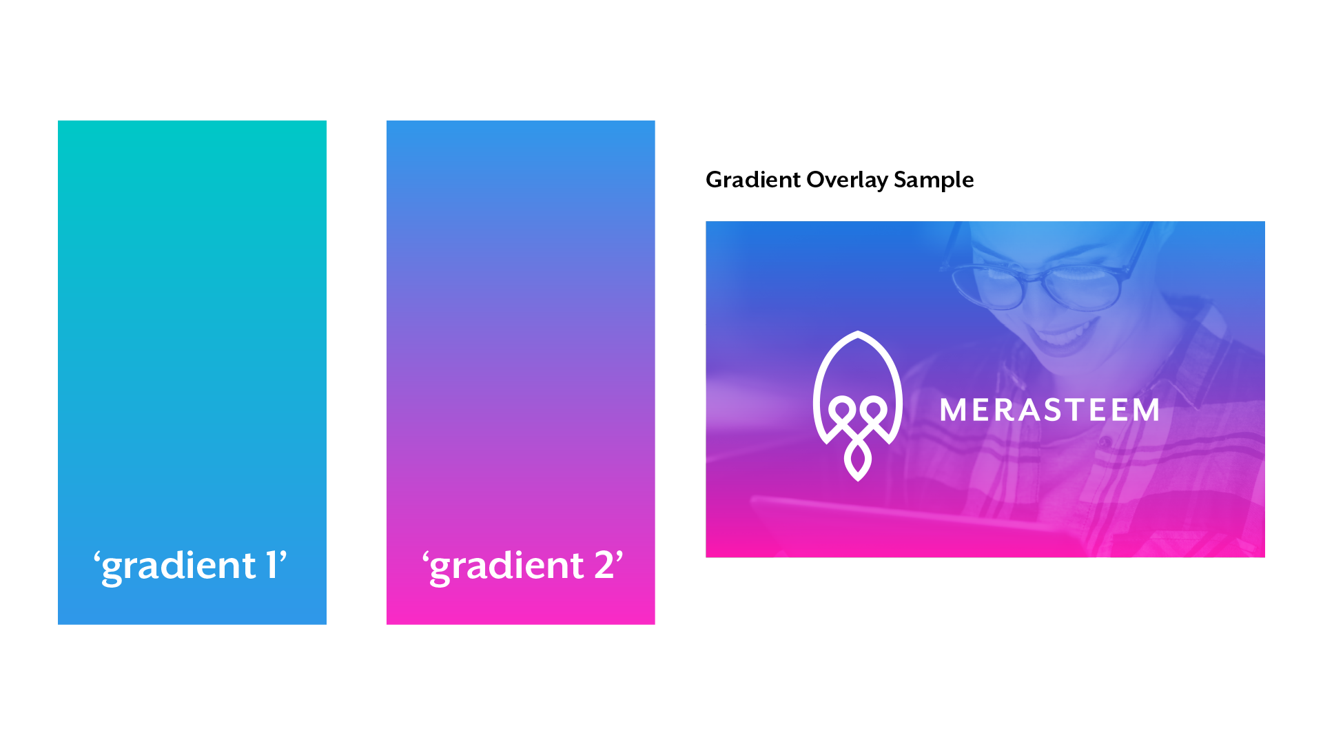
Using colors from the primary color palette, two gradients have been developed to be used as backgrounds and image overlays. Use of these gradients for logo color variations is not recommended.
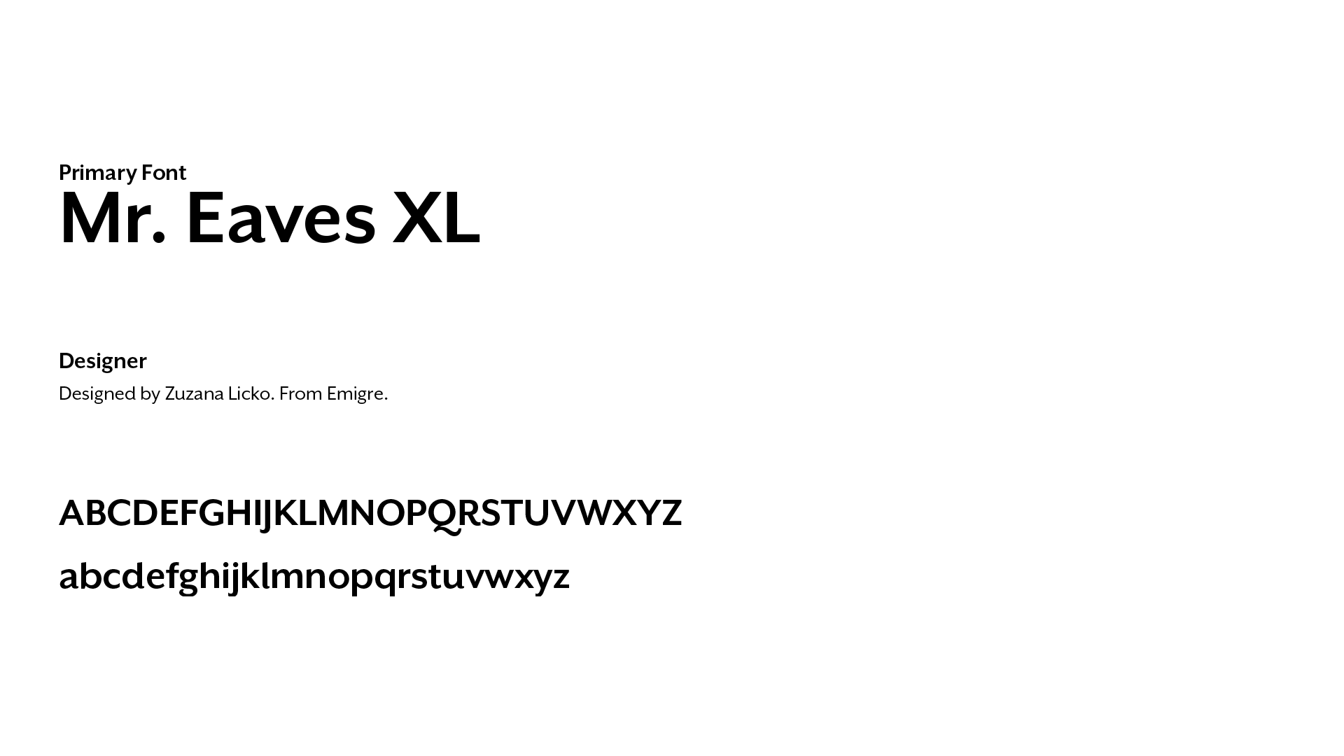
Typography
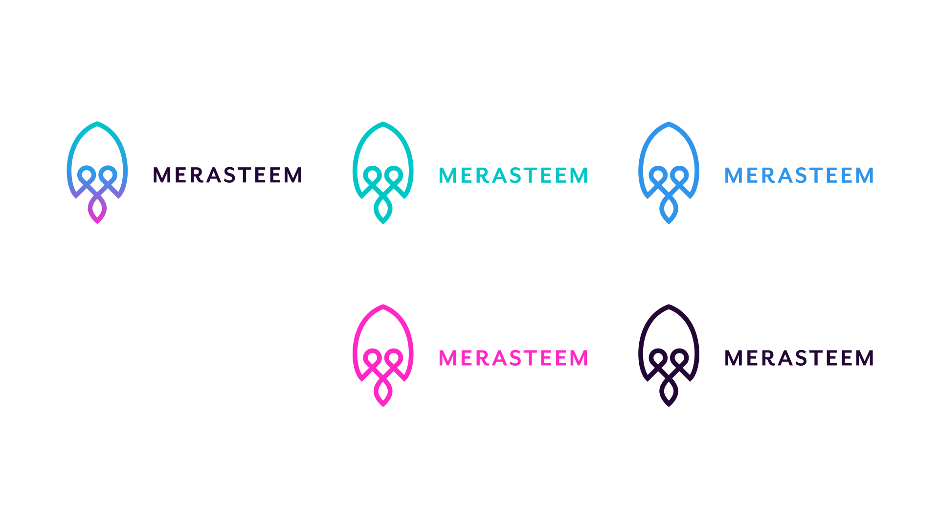
Color Variations
There are only 5 accepted and recommended color variations: main, teal, blue, pink, and purple.
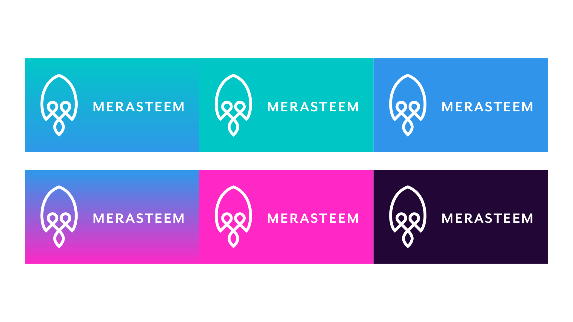
Reversed Color Variations
For reversed versions of the logo, the most visible solution is using the logo in white over the already described accepted colors: gradient 1, gradient 2, teal, blue, pink, and purple.
The logo can be used over images as well, but it is recommended to keep the defined brand colors or gradient overlays when doing so.
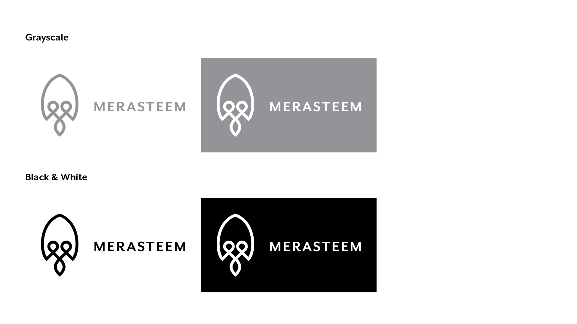
Black & White Variations
Logo Clearspace
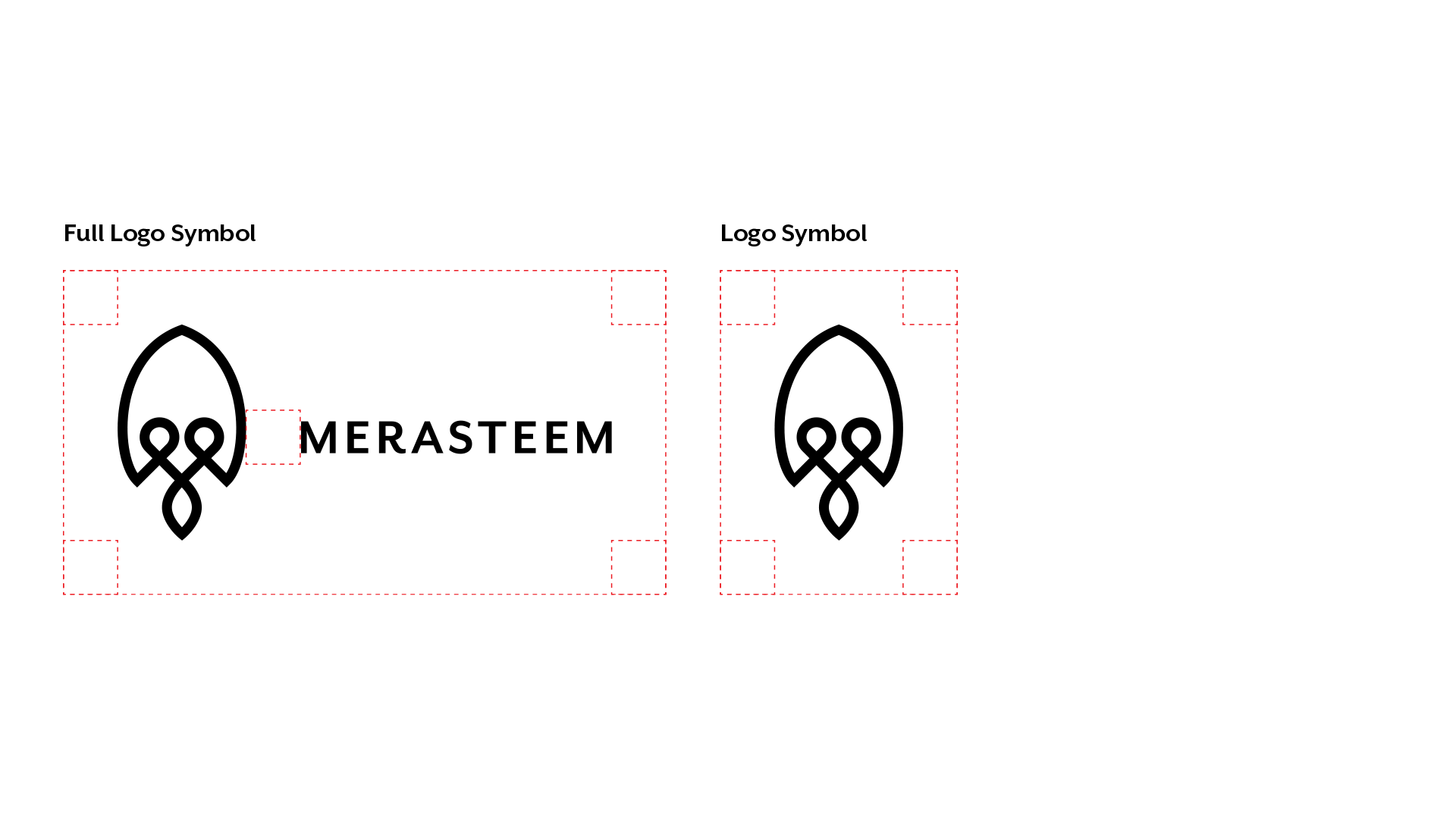
Whenever you use the logo, it should be surrounded by clearspace to insure its visibility and impact. No graphic elements of any kind should invade this zone.
To work out the clearspace, take the height of the logo and divide it in half. (Clearspace = Height/2)
Additional Sizes
Benefits / Improvements
- Strong concept built on business's core values
- Useful in all applications (print, web, mobile) and flexible in orientation.
- Recognizable
- Visible at all sizes
Proof of Authorship
Tools
- Paper & Pencil
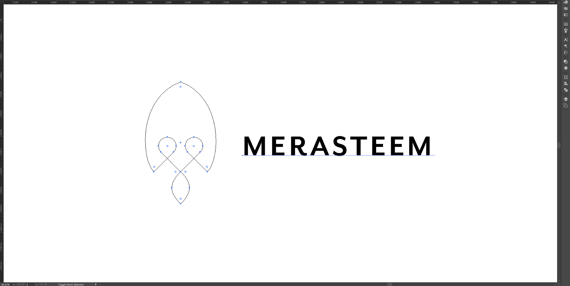
- Adobe Illustrator CC
Original Files
Proof of Work Done
