In an earlier post, I said I wanted to improve my art by undertaking works that are conceptual in nature, especially in those that pique my interest: fantasy, steampunk, and even cyberpunk. The challenge revolves around how bad I am in painting backgrounds and choosing my colors. I am also incredibly impatient.
I think it matters a lot that I am interested in the art I make for me to be able to complete even one.
Yesterday, I started to work on this piece that takes inspiration from the cyberpunk genre.
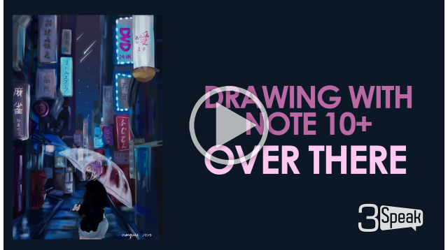
Over there
The goal was to create full colored drawing with background. I really wanted to draw super cool cyberpunk art, but for someone who's still in the process of learning, I have to settle with simple. I wanted to try everything that got my interest in the concept -- the contrast in colors: the pinks, the blues, and the blacks.

For me to conceptualize what I wanted to draw, I did some quick search on Pinterest for reference photos to play around with. I found the following:
The text in the store banners on the reference background picture were in Korean; I imagined the setting to be in Japan, though, so I googled Japanese cities (I was especially interested in Ikebukuro) for store signage texts. I bet some of the texts I'd written weren't accurate, but it wasn't for a lack of trying!
The Sketch
This one took a long while. Because I never really had to deal with backgrounds in prior drawings, perspective was especially difficult despite having reference.
At one point, I had to forgo some details (I was already imagining how difficult it would be fore me to paint over).
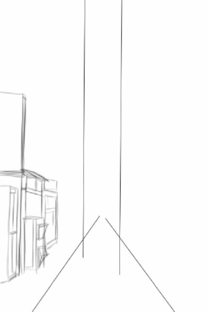
It was the girl that I really enjoyed drawing. Compared to the background, the girl only took up a small portion of the over all drawing. I didn't have to sketch so much details.
I initially drew her with these round eyeglasses, but somewhere during the painting part, I completely overlooked that part. I thought it looked OK even without the glasses, so I let it be.
Digital painting
I started with the background by applying highlights to places that should be illuminated and shadows to the parts that should essentially be darker. In hindsight, I think this could also serve as lighting practice.

The stores and signage. It is, without a doubt, generally about the street more than the girl. While I am really uncomfortable doing backgrounds, I think I enjoyed this one (kinda). But my most favorite part here was the ground. I don't know why I had so much fun with it.
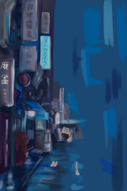
I didn't put much attention to the girl. I think my attention was too into the background that I just generally went over the girl with less care than I normally would.
I had a lot of plans for her at the start, though, which obviously didn't take place haha.
What surprised me most was how the transparent umbrella turned out. I actually really liked it! The raindrops part was essentially a lucky shot -- I didn't think it would turn out the way it did.
It turned out to be glowy because of two things:
- I duplicated the layer containing the raindrops;
- I applied Gaussian blur filter on the duplicate layer.
I wanted to play around her more, but I was afraid she just suddenly won't fit the picture.
Details
- Device: Samsung Galaxy Note 10+
- Apps:
- MediBang Paint for Android
- Snapseed
- Brushes: watercolor (at varying opacity settings); smudge; blur
Timelapse
(I wasn't planning to record anything, but when I was starting to paint the background and was beginning to like it, I eventually did xD So please excuse the fact that the recording started quite a while after I began coloring.)
Notes
When I was a kid, I really liked the color yellow. As I grew older, I got really attracted to both pink and purple. Sometimes, dark blue. What's your favorite color?

[ko-fi](https://ko-fi.com/erangvee) | [deviantart](https://www.deviantart.com/erangvee) | [twitter](https://twitter.com/erangvee) | [instagram](https://twitter.com/erangvee)