A striking book cover is the single most important element of book design. Your book's cover will serve as your work's first impression to the world (no pressure)! The cover has to capture a potential readers’ attention in seconds and hold it long enough to get them to look at your book further, whether it’s on a bookstore shelf or online.
Honestly, this part of the book creation process used to be my least favorite thing. There is such an immense amount of work that goes into the graphic design process that the average person blissfully unaware of. Imagine staring at a blank canvas, having all of the options in the world, and having to narrow it down to one single design. This step can make or break the book you've poured so much work into.
In order for the cover design process to be successful it’s vital to know what you want—to have a clear vision. Each little element of a book cover communicates certain things about your work to a potential reader, both consciously and subconsciously. After three decades, I’ve come to really enjoy the creative expression involved in the process.
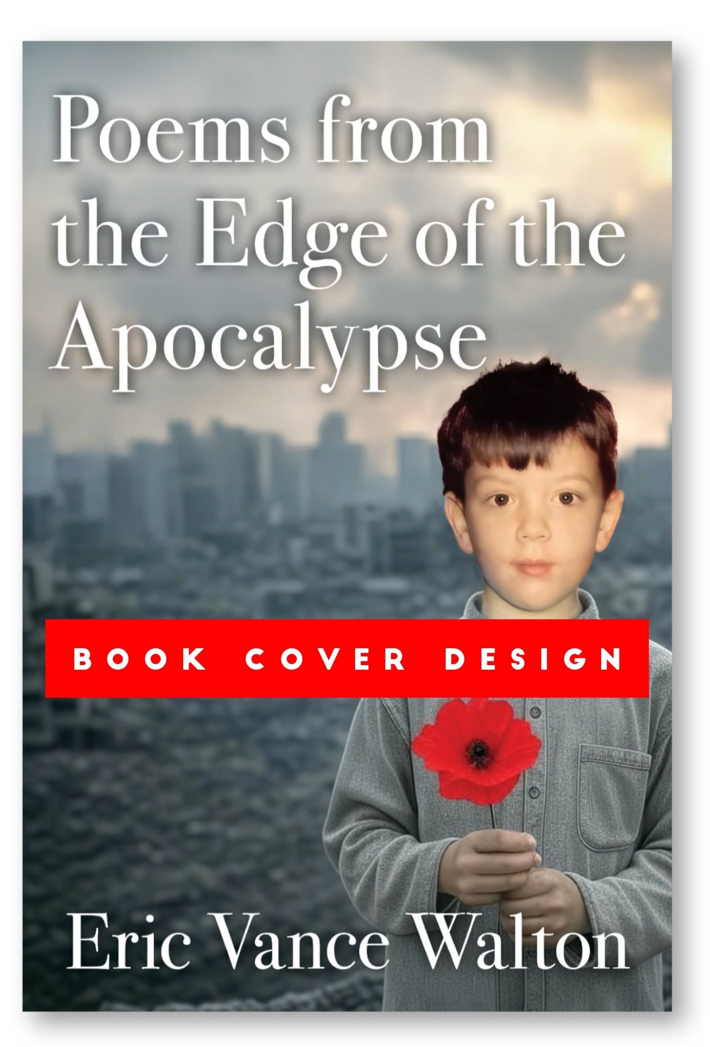
For those of you who’ve been following this series of posts you’ll remember after my epiphany of what I wanted the book cover to look like I had Grok create the following cover image:
This served as an initial starting point. Having AI create this image from my text prompt shortened and simplified the entire book cover process considerably. I sent this image that Grok created (based on my prompt) to my book designer asking if he could replace the head on the Grok-created image with a photo of mine as a child. He returned the following options as first drafts:
Cover Option A
Cover Option B
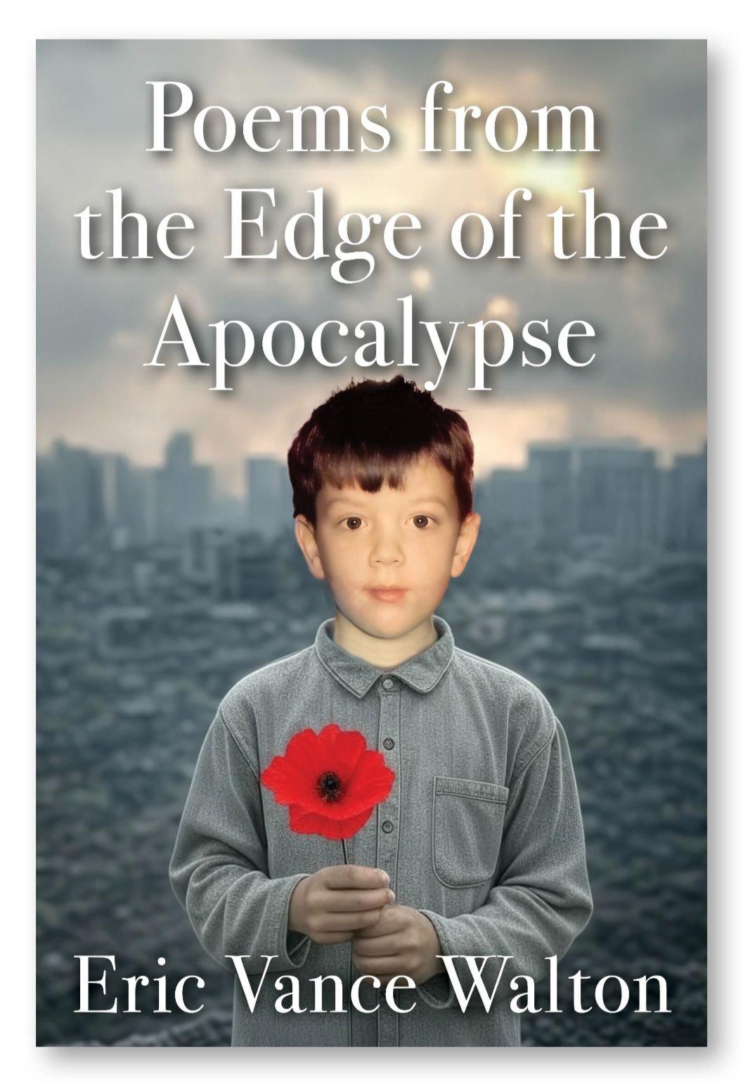
Cover Option C
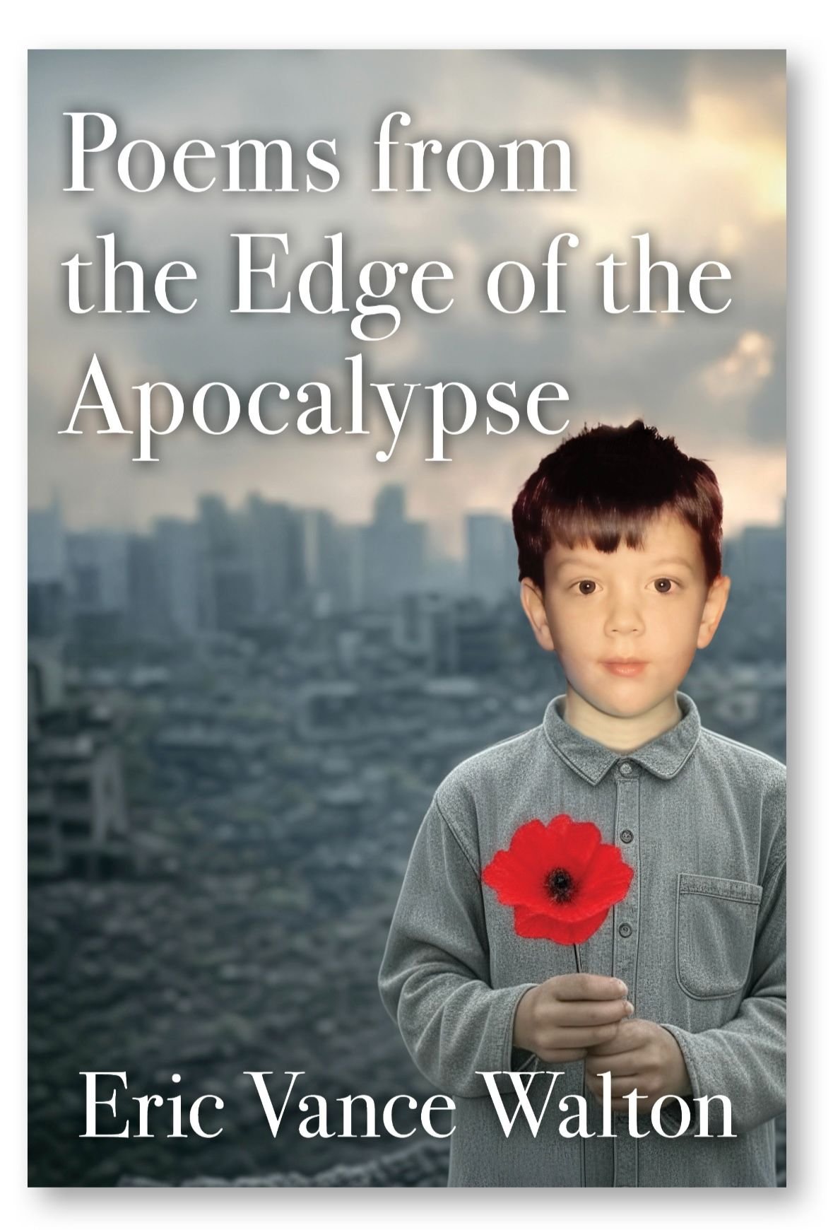
I chose Cover Option C because I appreciated how the photo of the child was offset, subtly tying into the word "Edge" of the title, and I liked the visual balance of it all. Although it didn't fully match my vision it was close.
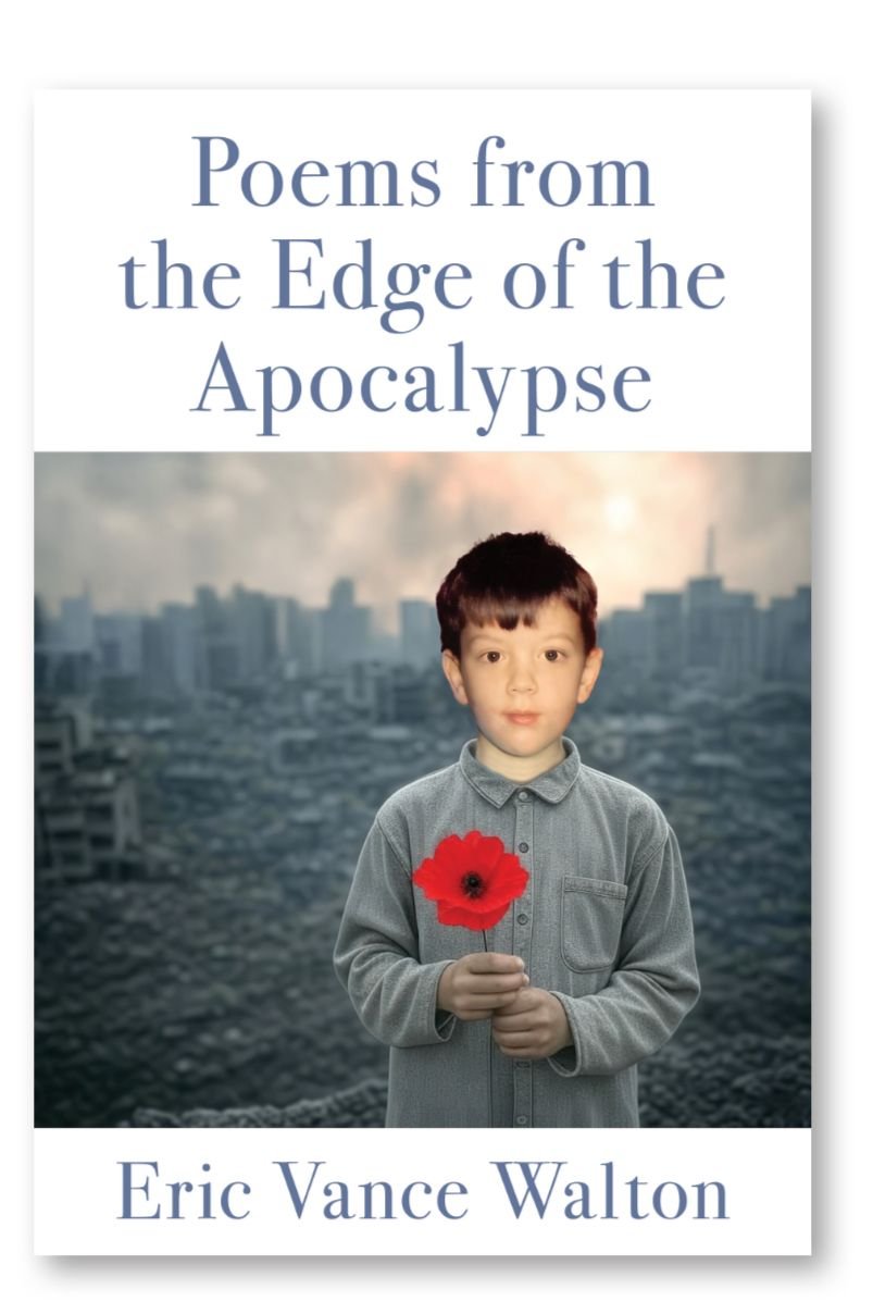
This morning, I responded with my feedback about the next round of changes I wished to see:
- Decrease the size of the child (me) by about 1/3rd.
- Make the general color of the background apocalyptic cityscape a few shades darker. I think this would add a little more contrast to help the title and red of the flower pop. It would also depict the gravity of storms that are on the horizon if humanity doesn't soon change its course.
- Regarding the title— can we increase the font size of "Poems from the Edge" and make those words more bold and then have a single line running under it in a smaller font reading, "of the Apocalypse"? I would also like it if we could make it look like light (or a glow) is coming from "Poems from the Edge", if possible.
I'm really happy with how this is moving along. Next steps will be back cover design and the book's internal layout. I also have to have some new author photos taken because all of mine are around five years old.
More updates will be coming soon! I hope you're all enjoying this glimpse into the book creation process. Have a good weekend everyone.
Be well, make the most of this day. Thank you for reading!
Growing weary of the ads and divisiveness on mainstream social media? If so, why not try Hive? Click on this link to sign-up and join our growing global community.
Want to Keep Up with My Travels? Please subscribe to my YouTube channel.